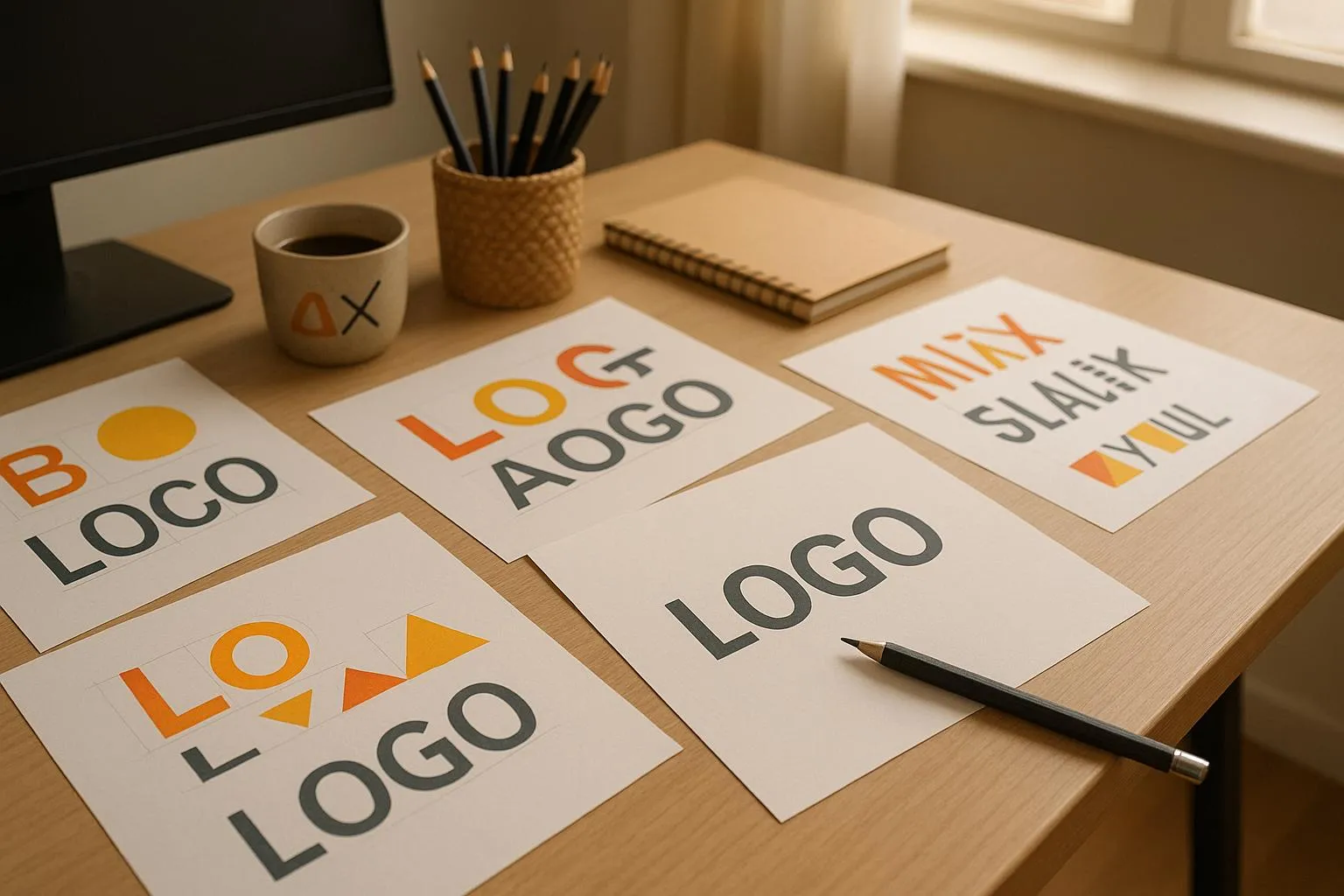
Your logo is your brand’s face, and consistency is key. Avoid these common mistakes to ensure your logo works everywhere - from business cards to billboards:
Inconsistent Colors: Always define and stick to exact color codes (RGB, CMYK, Hex, Pantone) for digital and print use.
Poor Scalability: Use vector files (like SVG) to keep your logo sharp at any size.
Cluttered Design: Simplify intricate details for smaller formats like app icons.
Font and Icon Mismatches: Use consistent font weights and styles, and align icons with typography.
Placement Errors: Leave enough clear space, align with grids, and adjust for different platforms.
Wrong File Formats: Use SVG or EPS for scalability, PNG for transparency, and ensure the right color space (RGB for digital, CMYK for print).
Color Consistency Problems
When colors aren’t consistent, it can confuse customers and weaken your brand’s identity.
Setting Standard Brand Colors
Nailing down exact color values is key to keeping things consistent. Your brand guidelines should clearly define:
RGB values for digital screens
CMYK values for printed materials
Pantone codes for specialty printing
Hex codes for web use
Here’s an example of how you can document color values:
Type
Primary Blue
Secondary Gray
Accent Red
RGB
0, 84, 166
128, 128, 128
237, 28, 36
CMYK
100, 49, 0, 3
50, 0, 0, 50
0, 88, 85, 7
Pantone
301 C
Cool Gray 7 C
185 C
Hex
#0054A6
#808080
#ED1C24
Having these values in place ensures your brand’s colors look the same, no matter where they appear.
Managing Colors Across Media
Colors can look different depending on the medium. Digital screens use RGB, while printed materials rely on CMYK, which can lead to unexpected shifts in appearance.
To keep colors consistent:
Test printed materials on various paper types and printing methods
Check digital designs on different devices
Develop color variations for use on both dark and light backgrounds
Tools like Logo Diffusion simplify color management across platforms. Its easy-to-use features ensure your brand colors stay consistent, whether on a phone screen or a billboard.
Size and Scale Issues
Creating a logo that looks sharp and recognizable at any size is key to maintaining a consistent brand image across different platforms and materials.
Why Vector Files Are Essential
Vector files ensure your logo stays crisp and professional, no matter how much you resize it. Unlike raster images like JPGs or PNGs, which blur or pixelate when enlarged, vector files offer:
Unlimited scaling without losing quality
Clear, sharp printing for everything from business cards to large signs
Consistent appearance across digital and physical platforms
Logo Diffusion's vector export feature can convert your designs into .SVG files, ensuring your logo stays sharp on everything from a smartphone screen to a massive billboard.
Simplify for Better Clarity
Overly detailed logos can lose their impact when scaled down. Fine details, decorative patterns, or overly intricate designs might become hard to read at smaller sizes. To keep your logo clear and recognizable:
Focus on core brand elements
Remove unnecessary patterns or details
Strengthen thin lines and adjust spacing
Create a simplified version for tiny applications, like app icons or small merchandise
Font and Icon Mistakes
Typography and icons are key to maintaining logo consistency. When fonts and icons clash, it can weaken brand recognition.
Choosing Fonts That Fit Your Brand
Every part of your logo design, including the fonts, should reflect your brand's personality and be easy to read across all applications. Here are some common pitfalls to avoid:
Inconsistent Font Weights Using different font weights across logo variations can dilute your brand's impact. Stick to a consistent weight hierarchy for all uses, whether it's a social media avatar or a business card.
Poor Font Pairing If your logo uses multiple fonts, make sure they work well together and maintain a clear visual hierarchy. For instance, pairing a bold sans-serif font for the company name with a subtler, complementary font for taglines can keep the design balanced and focused.
Select fonts that not only look good but also reflect your brand's identity.
Aligning Icons with Typography
Just like fonts, your icon design needs to complement the overall logo for maximum effect.
Matching Style and Weight The icon's style and weight should align with the typography to create a balanced and cohesive design. A mismatch in these elements can make the logo feel disjointed, reducing its effectiveness across different platforms.
Consistent Spacing The spacing between the icon and text should follow uniform ratios in every version of your logo. Consistent spacing, just like consistent color and scale, ensures your logo looks polished and professional.
Tools like Logo Diffusion can help you maintain these relationships by offering style transfer and vector export options, ensuring your logo remains visually cohesive across all formats and sizes.
Design Style Inconsistencies
Inconsistent design styles can weaken your brand identity.
Creating Style Guidelines
A style guide lays out clear rules for your design's core elements, ensuring consistency. These rules often cover:
Shape and Geometry: Defines shape language and geometric principles.
Line and Stroke: Specifies line weights and stroke styles.
Hierarchy and Proportions: Establishes visual hierarchy and proportional guidelines.
Textures and Patterns: Details how to use textures and patterns.
Spacing and Sizing: Includes negative space requirements, minimum sizes, and clear space specifications.
Background Compatibility: Ensures designs work with various backgrounds.
Element Relationships: Clarifies how design elements interact.
Logo Diffusion's style transfer feature helps ensure your design elements stay consistent across logo versions. Plus, its vector export tools keep your designs intact, no matter the format or size.
With these guidelines documented, you can ensure all logo variations align with your brand standards.
Maintaining Style Across Versions
Consistency across logo versions requires sticking to your style guide. Pay special attention to:
Design Elements: Keep line weights uniform, scale patterns and textures proportionally, and maintain visual weight in simplified designs.
Visual Balance: Ensure balanced spacing, consistent ratios, and adherence to the original design's hierarchy.
Logo Diffusion simplifies this with tools for color customization and brand asset creation, making it easier to maintain a unified brand look while following your established guidelines.
Trusted by over 250k+ users
Logo Placement Errors
Poor logo placement can weaken brand recognition and make your business appear less professional.
Establishing Placement Guidelines
To ensure your logo always looks its best, follow these key principles:
Clear Space: Leave a protective area around your logo to avoid crowding. A good rule of thumb is to use the height of a key logo element to determine the minimum space.
Size Consistency: Make sure your logo stays proportional and balanced with nearby design elements.
Grid Alignment: Use tools like Logo Diffusion to achieve precise grid alignment for a polished look.
These steps help you tailor logo placement to meet specific market expectations.
Tips for U.S. Market Placement
Website Headers: For U.S. web designs, logos are typically placed in the top-left corner.
Mobile Screens: Ensure your logo stands out on mobile devices. Tools like Logo Diffusion's responsive design features can help adjust placement without compromising brand guidelines.
Print Materials: On printed documents, position your logo prominently at the top to grab attention.
Retail Signage: Follow ADA guidelines by placing logos at eye level for better visibility.
Proper placement ensures your logo makes a strong impression across all platforms.
File Format Problems
Using the wrong file format can hurt your brand's image. It’s essential to choose the right format for each use case.
Using Vector File Types
Vector graphics rely on mathematical equations to create shapes, which makes them perfect for scaling. Whether it’s a business card or a billboard, vector files maintain their quality.
Here’s why vector formats are so useful:
Scalable Without Quality Loss: Resize them as much as you need - no pixelation.
Compact File Size: Typically smaller than high-resolution raster images.
Editable Elements: Adjust colors and shapes without sacrificing quality.
Sharp Results at Any Size: Ensures clean, professional visuals.
For logos, SVG (Scalable Vector Graphics) works best for digital platforms, while EPS (Encapsulated PostScript) is ideal for print. Tools like Logo Diffusion's vector export feature make it easy to create SVG files that look sharp at any size.
Now, let’s look at how to prepare your logo in multiple formats for different uses.
Preparing Multiple File Formats
Different platforms require specific file formats. Here’s a quick guide to help you prepare your logo files:
Usage
Recommended Format
Specifications
Print Materials
EPS, PDF
CMYK color space; 300 DPI minimum
Websites
SVG, PNG
RGB color space; transparent background
Social Media
PNG, JPG
RGB color space; size-specific versions
Mobile Apps
SVG, PNG
Multiple resolution versions
When exporting your files, keep these tips in mind:
Use Transparent Backgrounds: Save PNG files with no background for versatility.
Prepare Multiple Sizes: Export logos in various sizes, like 32x32px for favicons or 1200x630px for social media.
Keep Original Files Secure: Save master vector files for future updates or edits.
Conclusion: Building Strong Brand Identity
A consistent logo is key to creating a strong brand identity. Avoiding mistakes with logo variations helps ensure your brand remains unified and recognizable, building trust and familiarity across different platforms.
To maintain this consistency, focus on a few essential practices:
Use vector-format masters to ensure scalability
Document exact brand color codes for accuracy
Develop clear usage guidelines for your logo
Organize files by format to suit various applications
Tools like Logo Diffusion make it easier to keep your logo consistent across all versions.
Regularly review your brand assets to ensure they meet current standards while preserving core design elements. This proactive approach strengthens your brand's presence and helps it stand out in the U.S. market. By managing these details effectively, you create a cohesive and lasting impression.
FAQ
Lock one “source of truth” palette (Hex + RGB + CMYK + Pantone where needed) and apply it everywhere without guessing. In Logo Diffusion, keep the same colour values when generating variations so new exports don’t drift between versions.
Screens display colour with light (RGB) while print uses ink (CMYK), so the same colour can shift in brightness and saturation. The fix is to define print-ready CMYK/Pantone equivalents and test on real backgrounds before rolling out assets.
Switch to a vector master and export size-specific versions for each channel. Logo Diffusion helps by enabling vector-ready outputs and clean exports so you’re not relying on stretched PNGs or screenshots.
Vector files scale infinitely without pixelation because they’re built from shapes, not pixels. If the logo must work from favicon to billboard, a vector master is the only reliable base.
Choose one primary font system (brand font + allowed weights) and apply it consistently across every logo lockup and template. Avoid mixing “similar” fonts—small differences in letterforms are noticeable and make brands look unpolished.
Mismatch usually happens when icon line weight, corner radius, or geometry doesn’t match the type style. A practical fix is to align stroke weight and visual density, then re-check the logo at small sizes to confirm the icon and text feel like one unit.
Logo Diffusion supports controlled iteration so you can keep one style direction while adjusting only what needs changing (colour, spacing, simplified detail, layout). This reduces “random drift” that happens when each version is generated from scratch.
The biggest placement errors are inconsistent clear space, stretching proportions, and using different alignments across channels. Define a simple placement rule (safe zone + alignment standard) and apply it to web headers, print, and social templates.
Build a small “logo kit”: primary horizontal logo, stacked version, icon-only mark, and one-colour version—each tested on light and dark backgrounds. Export each version in the right formats so teams don’t improvise with low-quality files.
Keep a vector master for control and future edits, plus ready-to-use exports for common placements. For day-to-day work, save transparent raster files for web and social, and always keep the vector original as the master source.
Standardise four things: exact colour codes, approved fonts/weights, a vector master for scaling, and a repeatable export set for each channel. When those are locked, brand assets stay consistent even when multiple people handle the logo.
Ethan Brookes is a product-focused content writer covering AI tools, branding, and SaaS workflows. He writes practical guides on using AI for real-world design and product use, with a focus on brand-ready outputs and scalability.
.webp)


.webp)

.webp)
.webp)