How AI Style Transfer Improves Logo Color Consistency Without Breaking Brand Identity
May 13, 2025
.webp)

AI is transforming how logos are designed, especially in color adjustments. Using tools like style transfer, designers can quickly and precisely apply new color schemes while keeping a brand's identity intact. Here's what you need to know:
AI simplifies the process, saving time and enabling designers to focus on creativity while maintaining brand consistency.
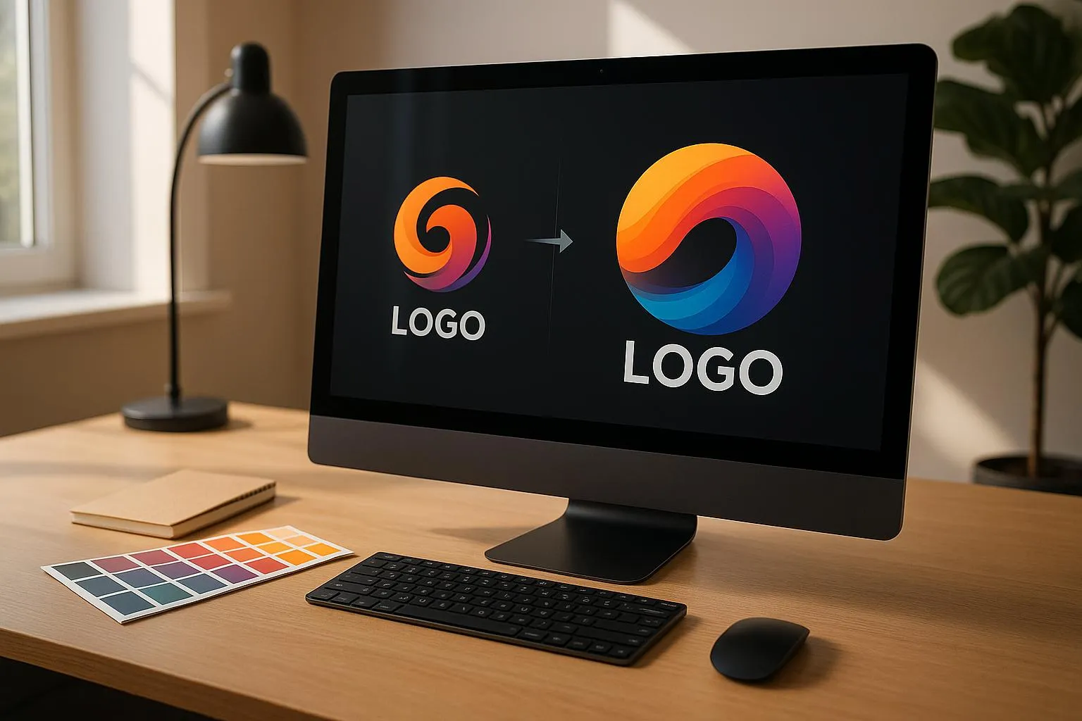
To get started, upload your logo in either vector format (.SVG) or a high-resolution PNG. Next, choose a style reference image that reflects the color palette you want to apply - ideally, something with bold and distinct contrasts. This reference will serve as a guide for transforming your logo's colors. Once uploaded, the platform allows you to transfer and adjust the colors with ease.
The AI works by analyzing the primary, secondary, and accent colors from your reference image and mapping them onto your logo. It does this while preserving the original structure and hierarchy of your design elements.
You can tweak the results using the color intensity slider and balance controls. These adjustments ensure your logo retains its visual appeal while embracing the new color scheme.
After the initial color transfer, you can fine-tune the design further with several tools:
Once you're happy with the final result, you can export your logo in a variety of formats to suit your needs:
These export options ensure your logo is ready for any medium, whether it's online or in print.
Choosing the right colors for your brand isn’t just about aesthetics - it’s about creating the right emotional connection. Different industries often lean on specific colors to communicate their values and goals. For instance, technology companies frequently rely on blues and greens to convey ideas like innovation and dependability. Financial institutions also favor blue tones, as they symbolize trust and stability. In healthcare, calming shades of blue and green are common, reflecting cleanliness and healing. On the other hand, retail and food brands often use reds and yellows to grab attention and inspire action.
Making sure your logo colors meet accessibility standards is crucial for ensuring visibility across all platforms and devices. According to WCAG 2.1 Level AA guidelines, here are the minimum contrast ratios you should aim for:
Always use an accessibility checker to ensure your contrast ratios are correct. This step guarantees that your logo remains clear and legible, no matter the background or viewing conditions. By prioritizing accessibility, you create a strong foundation for effective and inclusive branding.
Once accessibility is covered, the next step is maintaining brand consistency while allowing for creative flexibility. AI-powered tools like Logo Diffusion can help fine-tune your brand’s color palette without losing its identity. Here’s a simple breakdown of how to structure your color hierarchy:
For global brands, adapting your colors to suit local preferences can make a big difference. While your primary colors should stay consistent, you can use tools like AI style transfer to tweak secondary elements for specific markets. For example, adding reds and golds for Chinese markets can align your brand with local symbols of prosperity and good fortune. This kind of thoughtful adaptation can help strengthen connections with diverse audiences - and studies show that consistent branding can increase revenue by up to 23%.
Lastly, ensure all AI-driven color adjustments are documented in a centralized system. Include exact specifications in formats like HEX, RGB, and CMYK to maintain uniformity across teams. Research indicates that people need to see a brand 5–7 times to recognize it, so consistent colors are key to building that familiarity.
If AI style transfer causes unexpected color shifts, you can tweak saturation and intensity using Logo Diffusion's fine-tuning tools. Pay attention to the color temperature - warmer tones often evoke a sense of friendliness, while cooler tones suggest professionalism. Adjust these elements based on your industry. For instance, food and beverage brands might benefit from inviting, warm palettes, while corporate finance logos often lean toward cooler, more reserved tones. Above all, make sure your brand colors work together seamlessly.
Start with reference images that accurately represent your brand's colors. From there, use Logo Diffusion's color mapping feature to ensure primary colors stay true to your brand identity, while secondary hues can be adjusted as needed. This approach helps maintain consistency and prepares your logo for further tweaks, especially when dealing with subtle gradients.
To keep gradients smooth and avoid issues like banding, begin with high-resolution files and use Logo Diffusion's creative upscaler. For more intricate gradients, take a step-by-step approach:
Pay close attention to transition areas, and compare versions side by side to spot and fix any irregularities. This ensures your gradients stay polished and professional.
AI-powered style transfer is reshaping how businesses handle logo color adjustments. It allows companies to experiment with creative color variations while keeping their brand identity intact. This technology is changing the way designers approach color manipulation, making the process faster and more reliable, all while staying true to the brand's essence.
Logo Diffusion builds on these advancements with tools designed for precise color adjustments. Its intuitive color mapping and fine-tuning features let designers produce polished results without hours of manual effort. With options for customizable color themes and design styles, the platform simplifies the process of adapting logos for different uses.
Ethan Brookes is a product-focused content writer covering AI tools, branding, and SaaS workflows. He writes practical guides on using AI for real-world design and product use, with a focus on brand-ready outputs and scalability.


.webp)

.webp)
.webp)