.webp)

Your logo needs to look sharp everywhere - from a tiny app icon to a massive billboard. Designing a multi-resolution logo ensures your brand stays clear and professional across all platforms. Here’s what you need to know:
Quick Tip: Tools like Logo Diffusion can help you create scalable logos with features like vector export, background removal, and resolution upscaling.
Designing a logo that looks great at any size and on any platform requires attention to both technical details and design principles. Here’s how to make sure your logo performs well across different resolutions.
Vector graphics are your best friend when it comes to creating scalable logos. Unlike pixel-based images, which can blur when resized, vector graphics use mathematical equations to keep edges sharp and clean no matter the size. Stick to clean paths, avoid unnecessary anchor points, and simplify your shapes. Tools like Logo Diffusion can help you export crisp vector designs that maintain their quality on screens of all sizes. Once your vector file is ready, follow specific size and shape guidelines to ensure it works everywhere.
Here’s a quick size guide to help you tailor your logo for different platforms:
For maximum flexibility, design logos in both horizontal and vertical layouts. When working on smaller displays, simplify your design by removing intricate details and ensuring any text remains readable. This approach ensures your logo stays functional and recognizable across all devices and formats.
Consistent color is key to maintaining your brand identity. Here’s how to manage your colors effectively:
When exporting, use the appropriate color profile for the medium. For digital platforms, stick with RGB at a resolution of 72–150 DPI. For print, switch to CMYK with a resolution of at least 300 DPI to guarantee sharp, vibrant results.
If you’re using Logo Diffusion, take advantage of its tools to experiment with color variations. This makes it easier to create logos that are visually striking on every platform while staying aligned with your brand’s visual identity.
When designing a logo, it’s essential to tailor it to the specific standards of various platforms. Let’s break down the key requirements for print, digital screens, and social media.
Logos for print and digital use have distinct technical needs to ensure clarity and quality.
For print materials:
For digital screens:
Social media platforms have their own specific size requirements for logos. Here’s a quick reference:
Tips for social media optimization:
Tools like Logo Diffusion can simplify this process with features like Creative Upscaler and background removal, making it easier to create professional-looking assets tailored to social platforms.
With these guidelines in place, you’re ready to refine logos for maximum clarity and performance across all formats.
When designing logos that look great no matter the size, two key principles come into play: keeping the design simple and using vector graphics. A clean, streamlined design ensures your logo stays clear and recognizable even at smaller sizes, while vector formats keep it sharp and crisp, whether it's scaled up for a billboard or shrunk down for a favicon. Let’s dive into how to handle small-scale adjustments and layout flexibility.
For tiny spaces like favicons or app icons, intricate details can get lost. Simplify your design by removing elements that won’t translate well at smaller dimensions. This way, your logo remains distinct and easy to identify, no matter how small it gets.
Logos often need to adapt to different platforms and uses. For tighter spaces, an icon-only version can convey your brand effectively, while a more detailed layout works better for larger displays. Creating a set of logo variations tailored to specific contexts ensures your branding stays consistent and versatile.
Tools like Logo Diffusion’s vector export and design features make it easier to craft logos that perform seamlessly across both digital and print mediums.
Logo Diffusion simplifies the process of creating logos that look sharp and professional at any size, thanks to its AI-driven tools designed for multi-resolution design.
At the heart of Logo Diffusion are features that ensure your logos remain resolution-independent. Its vectorizer automatically converts designs into clean SVG files, so your logos stay sharp whether they're on a business card or a massive billboard.
The creative upscaler enhances resolution by up to 4X, making it perfect for large-scale printing or high-definition displays.
To give you full control over your designs, Logo Diffusion includes:
In addition to its main tools, Logo Diffusion speeds up the process of creating logos that work across different sizes. With its text-to-logo and sketch-to-logo features, the platform’s AI automatically generates variations tailored for various dimensions - all while preserving your brand’s look and feel.
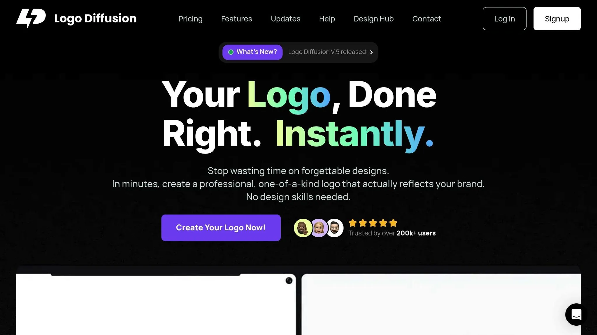
"Your Logo, Done Right. Instantly." - Logo Diffusion
This tagline captures the platform’s promise: quick, professional, and production-ready logos. Trusted by over 200,000 users, Logo Diffusion has become a go-to solution for scalable branding. Its Pro plan, priced at $49 per month, unlocks advanced features like the 4X creative upscaler and vector export, making it an excellent choice for professionals who need versatile logos for multiple platforms.
To get the most out of Logo Diffusion, consider these steps:
Thanks to its AI-powered upscaler, your logo will look just as striking on a smartphone screen as it does on a highway billboard. These tools align perfectly with the principles of multi-resolution design, ensuring your logo always makes an impact, no matter the scale.
Designing logos that work seamlessly across various resolutions isn’t just about keeping up with trends - it’s about ensuring your brand identity stands the test of time. The secret lies in blending timeless design principles with modern tools and techniques.
Start by focusing on the fundamentals. Using vector graphics as your foundation guarantees your logo stays sharp and scalable, no matter the size or display. Opt for clean, easily recognizable shapes and carefully chosen colors to ensure your design works across all mediums and platforms.
Today’s technology can take these basics even further. AI-powered tools now allow designers to export vector files, upscale designs creatively, and even prepare for advanced formats like dynamic 3D visuals. These features open up new possibilities, making your logo adaptable for platforms of the future, from augmented reality to virtual spaces.
Here are three key elements to keep in mind for a future-ready logo:
As technology and platforms evolve, so will the demands on your logo. By combining classic design principles with cutting-edge tools like Logo Diffusion, you can create a brand identity that thrives now and adapts effortlessly to what’s next.
Ethan Brookes is a product-focused content writer covering AI tools, branding, and SaaS workflows. He writes practical guides on using AI for real-world design and product use, with a focus on brand-ready outputs and scalability.


.webp)

.webp)
.webp)