How to Simplify Paths Without Losing Logo Shape

May 5, 2025
logo-design

Simplifying vector paths in logo design is all about reducing complexity while keeping the logo's shape intact. This process ensures logos look sharp, scale smoothly, and work efficiently across digital and print formats. Here's what you need to know:

  • Why simplify paths?
    • Fewer anchor points mean smaller file sizes, faster processing, and better rendering.
    • Simplified paths make logos easier to scale, edit, and export.
  • How to simplify paths effectively:
    1. Remove extra anchor points: Eliminate unnecessary points that don’t affect the shape.
    2. Use path simplification tools: Tools like Logo Diffusion’s Vectorizer can automate optimization.
    3. Maintain consistency: Ensure uniform stroke weights, balanced shapes, and smooth curves.
  • Test your logo at different sizes:
    • Check its clarity on small screens (like 16px icons) and large prints (like 3x6 ft banners).
    • Ensure details remain sharp and proportional.
  • Export in vector formats like SVG for scalability and quality across platforms.

Vector Paths in Logo Design: Core Concepts

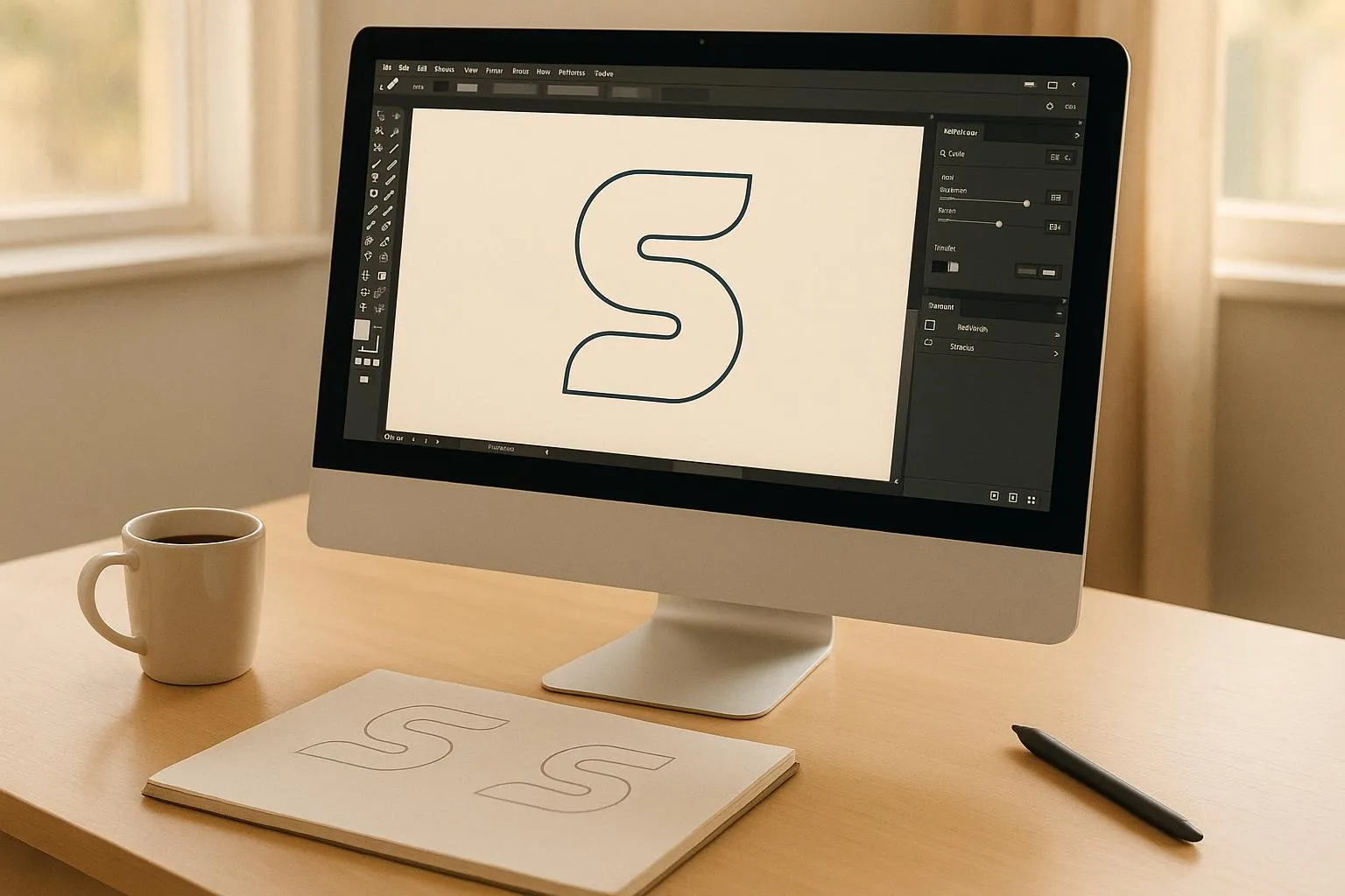
Vector paths are the backbone of logo design, allowing logos to scale infinitely without losing quality. These paths rely on mathematical formulas to define shapes using precise coordinates and curves, ensuring logos look sharp and consistent at any size.

Vector Path Basics

Vector paths are made up of three main elements:

  • Anchor Points: Mark where a path begins, ends, or changes direction.
  • Handles: Adjust the direction and curvature of the path.
  • Curves: The lines connecting anchor points, shaped by the handles.

Think of vector paths like a connect-the-dots drawing, but with customizable curves. The key is to use as few anchor points as possible to achieve smooth, clean curves. Mastering these components is essential for creating scalable, polished logos.

Clean Lines in Logo Design

Well-constructed vector paths are crucial for maintaining logo quality in any context. When done correctly, they ensure:

  • Sharp Edges: Lines remain crisp and precise, without blurring or pixelation.
  • Seamless Scaling: Logos look flawless, whether displayed as a tiny icon or a massive billboard.
  • Compatibility: Easy export for both digital and print formats.

At Logo Diffusion, these vector principles are applied to produce ready-to-use SVG files. Smooth, flowing curves that transition naturally from one to the next create a cohesive design. By focusing on refining your paths, you can systematically enhance your logo's overall quality.

3 Methods to Reduce Path Complexity

Remove Extra Anchor Points

Streamline your paths by eliminating extra anchor points. Too many points can bloat file size and create uneven curves. Focus on points that:

  • Fall along straight lines where fewer points could achieve the same result
  • Form curves that can be smoothed with fewer points
  • Interrupt the natural flow of the path

Go through each path carefully. Click on individual points and remove them if their absence doesn't affect the overall shape. Pay close attention to corners and curves, as these areas often accumulate unnecessary points.

Once you've manually refined the anchor points, consider using specialized tools for further adjustments.

Use Path Simplification Tools

Tools like Logo Diffusion's Vectorizer Access can automate path optimization with precision. Many modern vector editing programs also include features to simplify paths while retaining key design details. To get the best outcome:

  • Start with a higher tolerance level, then reduce it gradually to find the right balance between simplicity and detail
  • Apply simplification tools to similar elements at the same time
  • Check your work by previewing at different zoom levels to ensure important details remain intact

Maintain Consistency in Design Elements

After simplifying your paths, make sure all design elements are consistent:

Stroke Weights

  • Match stroke thicknesses and convert strokes to outlines
  • Scale strokes proportionally
  • Ensure uniform weight distribution throughout the design

Curves and Angles

  • Adjust curves so their handles are the same length
  • Standardize angles in geometric shapes
  • Use snap-to guides for precise alignment

Shape Balance

  • Group related elements for better organization
  • Maintain symmetry where needed
  • Check proportional relationships to ensure harmony

The goal is to create smooth, scalable curves that keep your logo looking sharp and professional in any context.

Professional Path Simplification Tools

Professional tools take path simplification to the next level, offering advanced controls to refine your designs. These tools are designed to simplify complex vector paths while keeping your logo's core elements intact.

Image Trace Settings for Complex Designs

When dealing with intricate logos, it's important to balance simplicity and detail. Advanced settings in tools like Logo Diffusion help convert detailed images into clean vectors without losing essential design features.

Here’s how to fine-tune your trace settings:

  • Start with maximum detail and gradually reduce complexity while keeping critical edges and curves intact.
  • Adjust thresholds and noise levels to retain important details.
  • Pay attention to typography, ensuring letters remain clear and sharp.
  • Protect key design features and ensure smooth gradient transitions.

After achieving a balanced vector, use pathfinder tools to address any overlapping shapes efficiently.

Pathfinder Tools for Shape Management

Pathfinder tools are essential for cleaning up overlapping shapes and unifying paths in your design. They help create clean, cohesive visuals.

Key Techniques:

  • Unite overlapping elements to combine shapes with shared areas.
  • Remove redundant paths to reduce file size and improve efficiency.
  • Smoothly join design elements for seamless connections.

The goal is to maintain a uniform path flow and ensure smooth transitions between shapes, resulting in a polished, professional design.

sbb-itb-384f04f

Quality Control for Simplified Logos

After simplifying your logo's paths using professional tools, the next step is thorough quality testing. This ensures your design is polished and performs well across various platforms and formats.

Size Testing Across Platforms

Your logo needs to look great at any size. Test it across different screen dimensions and use cases:

Digital Platform Testing:

  • Desktop screens: 250px to 1,000px wide
  • Mobile devices: 16px to 180px wide
  • Social media profile pictures: Typically 32px to 400px
  • Email signatures: Around 100px wide

Pay special attention to small details. Tools like Logo Diffusion's export features can help maintain sharp edges and prevent pixelation, which is common with raster images.

What to Check:

  • Ensure paths are smooth, even when zoomed in or out.
  • Confirm text remains readable, especially at smaller sizes.
  • Check that spacing between elements stays consistent.
  • Verify thin lines and intricate details don't disappear or blur.

Once you've tested digitally, move on to print to ensure your logo is ready for physical applications.

For print, vector formats are essential to keep your logo sharp and clean, no matter the size.

Print Testing Guidelines:

  • Test your logo at common print sizes:
    • Business cards: 2 x 3.5 inches
    • Letterheads: 8.5 x 11 inches
    • Large banners: 3 x 6 feet or larger

Logo Diffusion's Creative Upscaler can help you prepare high-resolution files for large prints, ensuring even detailed designs remain clear when scaled up.

Steps for Quality Verification:

  1. Export your logo in a vector format like .SVG.
  2. Check alignment at different zoom levels to ensure precision.
  3. Verify colors appear consistent across various print materials.
  4. Test reverse versions, such as white logos on dark backgrounds.

For print, keep a minimum line thickness of 0.25pt to avoid issues with fine details.

Conclusion: Simplifying Paths for Better Logos

Simplifying paths isn't just about reducing anchor points - it’s about creating logos that work seamlessly in any context. This approach is at the heart of effective logo design.

By focusing on clean vector paths, logos maintain sharpness and clarity, whether scaled for a billboard or a business card. This ensures they look professional across both digital and print formats.

The challenge lies in simplifying without losing the design's core essence. Vector exports play a crucial role here, producing high-quality assets. Tools like advanced vectorizers can help convert logos into clean .SVG files while keeping their defining features intact.

Here are some key tips to keep in mind:

  • Ensure line weights are consistent throughout the design.
  • Test simplified logos at different sizes to check their effectiveness.
  • Keep vector paths clean for better rendering.
  • Export in the correct formats to suit various applications.

FAQs

Simplifying vector paths while maintaining your logo's original shape and integrity requires careful adjustments. Start by using vector editing tools to reduce unnecessary anchor points, as these can make paths overly complex. Focus on areas where curves or lines can be smoothed without significantly changing the design. Tools like path simplification or smart smoothing in vector software can help streamline this process.

It's important to frequently compare your simplified version with the original design to ensure the logo's key features and proportions remain intact. For logos created or edited using AI tools like Logo Diffusion, you can also leverage built-in features to refine and export simplified vectors, ensuring high-quality results without compromising your design's essence.

What mistakes should I avoid when simplifying paths in a logo design?

When simplifying paths in a logo design, it's important to avoid a few common pitfalls to maintain the logo's integrity:

  • Over-simplifying curves or details: Reducing too many points can distort the original shape, making the logo lose its intended look.
  • Ignoring symmetry: For symmetrical designs, ensure simplification doesn’t create uneven or mismatched elements.
  • Not testing at different sizes: Simplified paths can look fine at one size but may lose clarity or balance when scaled up or down.

Always review the changes carefully and test the logo in various contexts to ensure it remains visually consistent and professional.

Why should I test my logo at different sizes and on various platforms after simplifying its paths?

Testing your logo at different sizes and on various platforms is essential to ensure it remains clear, legible, and visually appealing. Simplifying paths can sometimes alter small details, which may impact how the logo looks when resized or displayed in different formats.

By testing, you can catch potential issues like distorted shapes or loss of detail early on, ensuring your logo maintains its integrity across all applications, whether it's on a business card, website, or billboard.