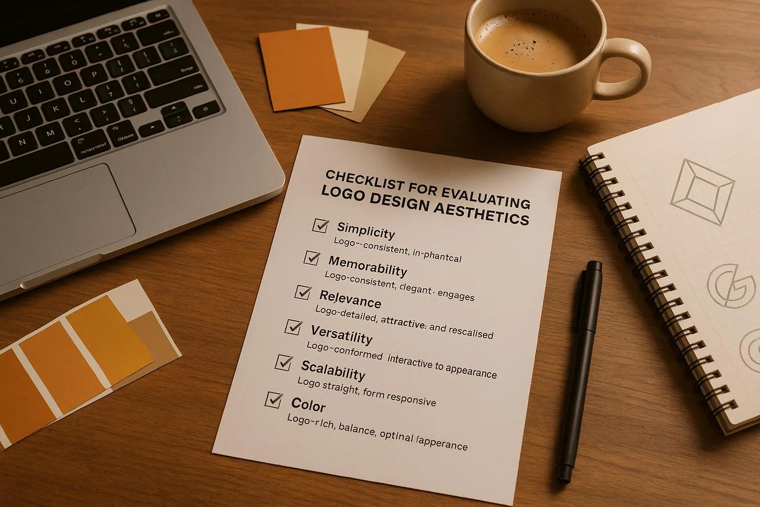
A logo is more than just a design - it's the face of your brand. To ensure your logo works across all platforms and resonates with your audience, evaluate it using this simple checklist:
Typography: Is the font legible, well-spaced, and aligned with your brand's personality? Test it on different backgrounds and sizes.
Color: Does the color palette match your brand's message, offer enough contrast, and work in print, digital, and monochrome formats?
Symbol Design: Is it simple, scalable, and culturally appropriate? Check how it looks with and without text.
Technical Quality: Does the logo maintain clarity at all sizes, from 16px to billboard scale? Use proper file formats (SVG, PNG, EPS, PDF) for different uses.
Background Testing: Does it stand out on light, dark, and transparent backgrounds?
Brand Fit: Does the logo reflect your brand's tone, align with your target audience, and stand out in your industry?
Modern tools like Logo Diffusion can help refine your design with AI-powered features like sketch-to-logo conversion, color adjustments, and high-quality vector exports. Use these tools to ensure your logo is polished, professional, and ready for any application.
Key Logo Design Elements
When analyzing a logo's design, focus on three main components: typography, color choices, and symbolic elements. These are the building blocks of a strong and effective brand mark, guiding further technical and branding decisions.
Text and Font Choice
Typography is a cornerstone of many logos, making font selection a critical factor in brand identity. Key considerations include:
Legibility: Ensure the text is easy to read at different sizes.
Spacing: Pay attention to character spacing and kerning for a polished look.
Font Personality: Choose a typeface that aligns with the brand's values and fits its industry.
Balance: The font weight should complement other design elements.
Always test how the font reads on different backgrounds to guarantee clarity.
Color Selection
Choosing the right colors is essential for reinforcing brand messaging and maintaining consistency. A good color palette should:
Align with the brand's message and identity.
Stay consistent across all branding materials.
Be accessible and offer sufficient contrast for readability.
Color Application
Key Considerations
Print Materials
CMYK accuracy and Pantone matching
Digital Displays
RGB values and proper screen calibration
Single Color
Performance in monochrome designs
Reverse Applications
Visibility on dark backgrounds
Symbol Design
Symbols often serve as the centerpiece of a logo, requiring thoughtful design to ensure effectiveness. Focus on the following:
Simplicity: Keep it clean and easily recognizable.
Scalability: The symbol should look sharp at any size.
Cultural Relevance: Verify it conveys appropriate meanings across different markets.
Visual Harmony: The symbol must work seamlessly with the typography.
Test the symbol both with and without accompanying text to confirm its strength in various applications. This ensures the logo remains impactful in every context.
Technical Quality Checks
Once you've reviewed the core design elements, it's time to evaluate the technical aspects to ensure your logo performs well in all applications.
Size and Clarity
Your logo should be clear and effective at any size. Here's how to test it:
Minimum Size Testing: Ensure the logo is readable at 16px for digital use and 0.5 inches for print.
Maximum Size Performance: Check that the logo remains sharp and clear when scaled up for large displays like billboards.
Detail Preservation: Confirm that small details stay visible and don't blur or distort.
After size testing, ensure your logo files meet the necessary technical standards.
File Types and Quality
Using the right file formats is essential for maintaining quality across different platforms. Here's a quick overview:
File Format
Primary Use
Key Benefits
SVG
Digital/Web
Scalable, lightweight, and editable
PNG
Digital/Web
Transparent background, ideal for effects
EPS
Print
Preferred format for professional printing
PDF
Universal
Maintains vector quality, highly compatible
Keep a full set of these formats in your brand asset library to cover all potential uses.
Background Testing
It's important to test how your logo looks on various backgrounds to ensure versatility:
Light Backgrounds:
Test on white and light-colored surfaces.
Verify that all elements have enough contrast to stand out.
Ensure thin lines and subtle details remain visible.
Dark Backgrounds:
Review the logo's performance on black and dark surfaces.
Make sure text is easy to read and design elements don't fade into the background.
Transparent Applications:
Check for clean, sharp edges on transparent backgrounds.
Test overlays on patterned or textured surfaces.
Look for any color bleeding or unwanted artifacts.
Conduct these tests for both digital and print applications to ensure your logo maintains a consistent and professional appearance in all formats.
Brand and Design Standards
Brand Message Match
Ensure your logo reflects your brand's personality. For a professional audience, the design should convey sophistication and trustworthiness. It’s important that the style aligns with your industry while maintaining a look that sets your brand apart.
Colors play a key role in how your brand is perceived. Your color palette can evoke specific emotions and associations:
Color
Emotional and Brand Associations
Cool Tones
Trust, stability, professionalism, technology
Warm Tones
Energy, passion, creativity, excitement
Earth Tones
Comfort, reliability, natural, organic
Monochrome
Elegance, timelessness, luxury
Your logo should resonate with your target audience. Consider cultural norms and preferences to ensure your design communicates effectively. This alignment helps your brand stand out while staying relatable to your demographic.
Design Distinctiveness
Industry Context Review Analyze how your logo compares to others in your industry. While it’s fine to incorporate industry-specific themes, steer clear of overused symbols and predictable clichés. Find creative ways to represent your brand that make it memorable.
Visual Hierarchy Check Evaluate how the elements of your logo work together. Key features should naturally grab attention first, with secondary elements supporting the overall design without creating clutter or confusion.
Style Implementation When using tools like Logo Diffusion, take advantage of their style transfer options to craft a unique look. Logo Diffusion offers over 45 curated design styles, letting you experiment with creative directions while keeping your brand consistent. Focus on:
Typography: Combine fonts in ways that feel fresh and aligned with your brand.
Symbols: Interpret symbols in a way that feels personal to your brand.
Colors: Build custom color relationships that enhance your logo’s impact.
Composition: Explore original layouts that make your logo stand out.
AI Design Tools
AI tools now make it easier to refine and perfect your designs, building on earlier technical quality checks.
Trusted by over 250k+ users
Design Adjustments
AI tools can help fine-tune your logo while sticking to established design principles. With Logo Diffusion's text-to-logo feature, you can make precise changes using natural language prompts. The platform also offers style transfer options, allowing you to try out over 45 curated design styles.
Color and Style Refinement Logo Diffusion's color customization tools help ensure your logo aligns with your brand's visual identity. You can:
Check color combinations against brand guidelines.
Ensure all logo elements work together harmoniously.
Design Evolution Tools Turn rough sketches into polished logos with the sketch-to-logo feature. This tool enhances your initial ideas while staying true to your original vision. Adjust details like symbol placement, proportions, negative space, and overall composition.
File Export Options
Refining your design is just one step - controlling file output is just as important for consistent presentation across platforms.
Logo Diffusion's vector export feature ensures your assets are production-ready. The exported files maintain crisp edges and smooth curves, no matter the scale.
Plan Level
Monthly Vector Exports
Additional Features
Basic
50 exports
2x upscaler
Pro
100 exports
4x upscaler
Elite
200 exports
4x upscaler
Resolution Enhancement The Creative Upscaler tool enhances image quality by:
Adding detail without introducing artifacts.
Keeping edges sharp, even in intricate designs.
Optimizing resolution for different display needs.
Ensuring compatibility with various background colors.
Final Checklist Review
This final review focuses on ensuring your logo design meets high standards by utilizing Logo Diffusion's AI-powered tools for typography, color, and symbol evaluations.
Key Design Elements
Use Logo Diffusion's integrated tools to evaluate and refine essential aspects of your logo:
Feature
Font clarity, spacing, and hierarchy
Style transfer with 45+ curated font options
Brand alignment and contrast
Color editing and customization tools
Scalability and balance
Sketch-to-logo refinement capabilities
Vector format and resolution
Creative Upscaler and vector export options
Once these elements are reviewed, make any necessary adjustments using the platform’s AI tools.
Design Refinement
Fine-tune your logo with features like sketch-to-logo adjustments and vector exports. The background removal tool allows you to test your design in various settings, ensuring it works seamlessly across different applications.
High-Quality Scaling
Logo Diffusion’s 4x upscaler ensures your logo maintains top-tier quality whether it’s on a business card or a billboard.
Export Options
Easily export your logo in the formats you need. The Elite plan offers up to 200 vector exports per month, giving you production-ready assets for any project.
"Logo Diffusion V.5 is the latest version, offering smarter, faster, and more creative logo design capabilities."
– Ali Rahmoun, founder of Logo Diffusion
FAQ
A fast professional check is: test the logo at icon size, in one colour, on light/dark backgrounds, and in a wide header layout. If it fails any of those, the logo needs simplification, stronger contrast, or better spacing before it’s ready for brand use.
Logo Diffusion helps by letting you quickly generate cleaner variations and refine details so the mark stays readable at favicon and social avatar size. The key is to reduce tiny details, increase spacing, and ensure the silhouette stays clear when scaled down.
The most important typography checks are readability, spacing (kerning), and hierarchy between main name and any tagline. A logo can look “almost right” but fail in real use if letter spacing collapses at smaller sizes or the font mood doesn’t match the brand.
A logo colour palette works when it holds contrast on screens and translates cleanly to print without turning muddy or inconsistent. Test it in monochrome, reverse (light on dark), and in typical placements like website headers and social posts.
Check whether the symbol still feels “on brand” without text and whether the wordmark still looks complete without the symbol. If either part collapses alone, the system needs better balance or a simplified secondary version.
Every logo should pass size clarity checks, edge cleanliness, and format readiness for the channel. A logo that looks fine in a mockup can still fail if edges blur, thin lines break, or the export format is wrong for print or web.
Keep a vector master for scalability and a high-quality transparent raster export for everyday digital use. A vector master is your insurance policy for resizing, printing, and future brand updates.
Logo Diffusion helps by supporting export workflows that keep the logo sharp across sizes and use cases, including clean assets for web and marketing placements. This reduces the common problem of teams using low-quality screenshots instead of proper logo files.
Most logos fail because they look inconsistent across contexts—too detailed for small sizes, low contrast on dark backgrounds, or typography that doesn’t match the brand tone. A professional logo system needs a primary version and simplified variants for small placements.
Run a quick “industry scan” test: place the logo next to competitor logos and ask whether the silhouette and typography still feel uniquely yours. If it blends in, refine the core shape logic or typography voice rather than adding extra decoration.
Before publishing: confirm legibility at small sizes, strong contrast on light/dark backgrounds, clean spacing, and correct export formats for web, print, and social. Once those are locked, you can safely roll the logo out across templates and brand assets.
Ethan Brookes is a product-focused content writer covering AI tools, branding, and SaaS workflows. He writes practical guides on using AI for real-world design and product use, with a focus on brand-ready outputs and scalability.
.webp)


.webp)

.webp)
.webp)