Retro Logo Prompts: 6 Real Prompts and the Logos They Made

A retro logo prompt works when it names things the logo can draw: bendy cartoon limbs, a script with a long tail, a barber pole, lines cut like an old print. Here are six prompts real users typed into Text to Logo in Logo Diffusion, shown as typed, with the logo each made and its style.
Retro Mascot: the style brings the cartoon era
Retro Mascot, one of the 11 logo styles in Text to Logo, draws like early cartoons: in the gallery its logos come back with white gloves, bendy limbs, pie-cut eyes and a thick black outline. The prompt only names the subject, the pose and a prop. This one has no retro word in it.
Coffee cup mascot, walking, making peace sign. Googly eyes, cheerful smile, wearing sneakers.

To push a mascot toward one cartoon era, name it as an art style. "Rubber hose" is the usual name for the early cartoon look with limbs that bend like tubes, and it works even when the logo is only a head.
Smiling young boy mascot face wearing a side-tilted baseball cap, cheerful expression, vintage rubber hose art style.

Both prompts stop at one or two props, and both logos still read as one clear shape when they are small.
Make your logo with Logo Diffusion's AI logo generator. Describe it, sketch it or upload an image, then turn it into a layered SVG with Vectorize. Try it for free.
Retro script: ask for the lettering and the rays
A slanted script with a long tail under the name and rays behind it is a classic sports and diner look from the middle of the last century. Ask for those parts by name. This prompt asks for a "retro crest", "vintage lettering" and "rays", and it puts the name in quotation marks, which tells Text to Logo the exact words the logo should carry.
A dynamic retro crest showing the text "Impact" with bold vintage lettering, a small heraldic shield, and energetic rays.

This one ran in the Pictorial style, and the quoted name still leads the logo. The two colors, navy and teal, keep the rays from crowding the script.
Name an object that is already old
Some objects carry their decade with them. A striped barber pole says old-school barbershop before anyone reads the name, so the prompt only adds the word "classic".
Morphed lettering showing the text "Next Wave" fluidly integrating with a classic barber pole silhouette.

Pick an object that survives as one simple silhouette. The pole is a single upright shape with stripes, so it stays easy to recognize when the logo is small.
Badge/Crest: the old team patch
Badge/Crest draws the frame for you: a shield, a circle or, here, a baseball diamond, with the name set inside. A sports badge reads as retro because the frame recalls old team patches. Write the name into the prompt so it lands inside the frame.
showing a sun wearing a baseball cap and holding a bat, integrated into a baseball diamond. Main Text: Tokyo Suns.

A heavy black outline runs around the badge and the figure, which is what makes it read as a single patch. Our guide to emblem logos covers where a badge layout works and where it struggles.
Engraved: the old print look
Engraved draws in rows of parallel cut lines, like the art on an old banknote or a printed label. It can make a joke subject, here a turtle in sunglasses, look like it came off a vintage package.
cool turtle, looking to the side, wearing sunglasses, Detailed scutes texture. Scales visible.
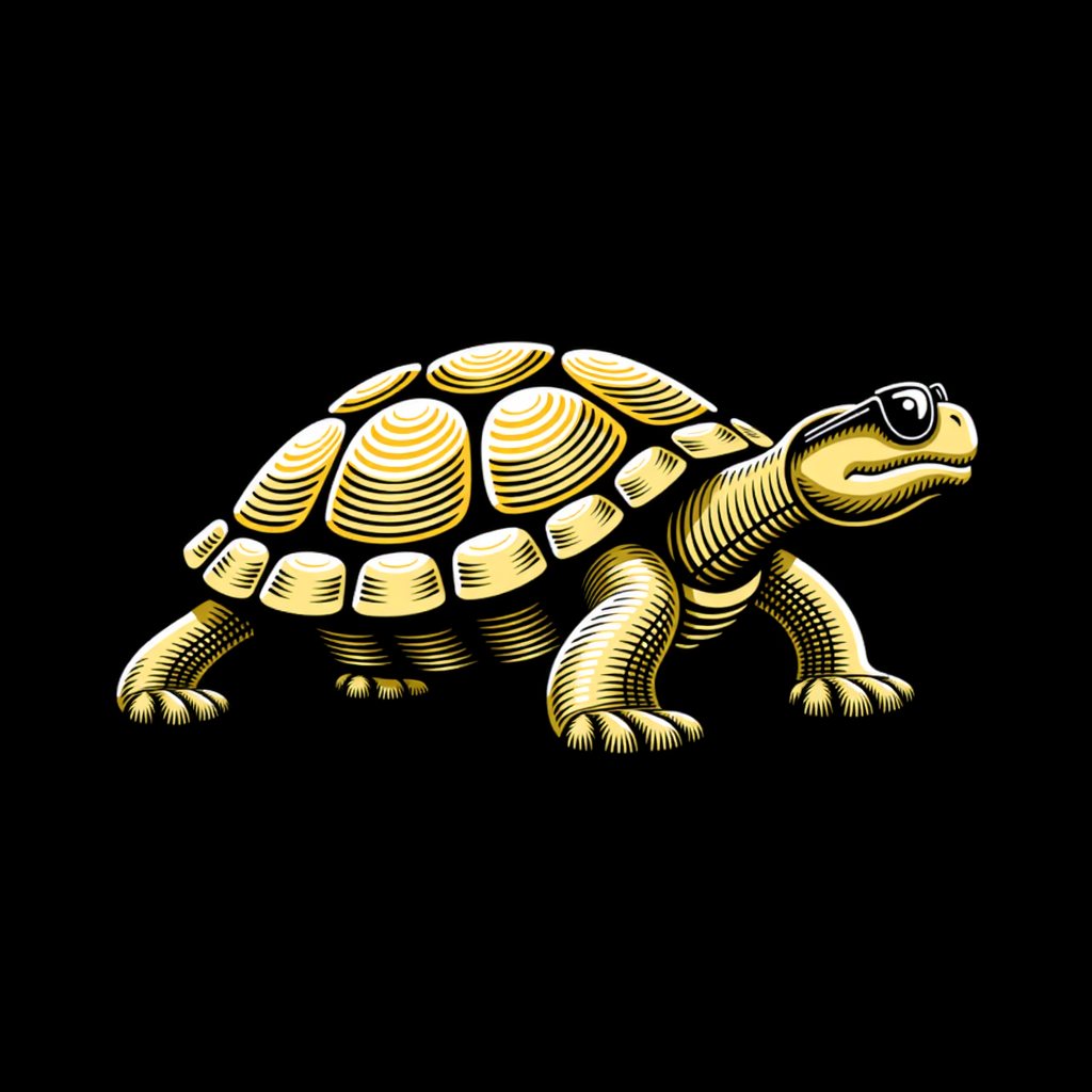
Engraved is the one retro style where asking for detail pays off, because the lines are the look. In the other styles, leave texture words such as grain or distress out of the prompt and keep the shapes clean.
Retro, and still professional
A retro logo still has to work on a sign, a cup and a phone screen. The six logos above hold up for the same few reasons.
Each logo above sticks to one look: an early cartoon, a sports script, a barbershop, a team patch, an old print. A prompt that asks for chrome, script and engraving at once asks for three periods, and the logo has to pick.
Every logo here uses flat color on a plain background. None of the six prompts names a color, so the palettes were chosen for them: navy, mustard, teal, orange-red and brown, on cream or black. If you have brand colors, name them in plain words, such as "navy and mustard on cream". Our guide to logo color combinations lists 50 palettes with hex codes.
The lettering on Impact and Next Wave keeps thick strokes and a clear baseline, so the names still read when the logo shrinks. If you are choosing type for the name, our guide to types of fonts covers script, serif and display faces.
Try these prompts
Paste any prompt above into Text to Logo, swap in your own subject and name, and pick the style it ran in. Text to Logo is 2 credits per image: a paid generation returns 4 options for 8 credits, and a free one returns 2 options for 4 credits. When you click Generate, the built-in prompt enhancer rewrites your prompt first. Turn it off to keep your own wording. For building a prompt from scratch, our five steps for refining AI logo prompts walk through each part.
Frequently asked questions
What colors make a logo look vintage?
Warm, slightly muted colors on a cream or off-white background read as vintage: mustard, brick red, navy, teal and brown. Two or three colors plus the background is enough, set flat, the way old printed labels used only a few inks.
Warm, slightly muted colors on a cream or off-white background read as vintage: mustard, brick red, navy, teal and brown. Two or three colors plus the background is enough, set flat, the way old printed labels used only a few inks.
Should I write the decade in a retro logo prompt?
You can, but a decade on its own gives the logo little to draw. None of the six prompts on this page names a decade. Each one names a subject and the parts that carry the look, such as a rubber hose art style, a barber pole or rays behind a script, and the style does the rest.
You can, but a decade on its own gives the logo little to draw. None of the six prompts on this page names a decade. Each one names a subject and the parts that carry the look, such as a rubber hose art style, a barber pole or rays behind a script, and the style does the rest.
Can I make a retro logo from a sketch?
Yes. Sketch to Logo takes a photo or scan of your drawing and redraws it in one of the 11 logo styles, Retro Mascot, Badge/Crest and Engraved included. It costs 8 credits a generation. On the free plan, Sketch to Logo has three sketch styles.
Yes. Sketch to Logo takes a photo or scan of your drawing and redraws it in one of the 11 logo styles, Retro Mascot, Badge/Crest and Engraved included. It costs 8 credits a generation. On the free plan, Sketch to Logo has three sketch styles.
How do I get my business name on a retro mascot?
Write the name in quotation marks in the prompt, and Text to Logo uses it as the logo text. If you already have a mascot you like, Logo System, one of the Magic Editor's Elements, turns one logo into wordmark, lettermark, emblem and symbol versions.
Write the name in quotation marks in the prompt, and Text to Logo uses it as the logo text. If you already have a mascot you like, Logo System, one of the Magic Editor's Elements, turns one logo into wordmark, lettermark, emblem and symbol versions.


Start with the material prompt.
The honest test is a real project, not a demo. 24 credits, no card.