.webp)

Lighting is the secret to making 3D logos stand out. Proper lighting adds depth, highlights textures, and makes your logo visually striking and memorable. Whether you're aiming for a polished metallic look or a soft, approachable vibe, understanding lighting techniques is key. Here's a quick overview:
Mastering these basics can transform your 3D logo into a professional, eye-catching design that leaves a lasting impression.
When it comes to crafting standout 3D logos, understanding the key lighting types is essential. Directional, point, and ambient lighting each bring unique qualities to the table, helping you shape the mood, depth, and overall impact of your design. Let’s break down what makes each type distinct and how they can elevate your logo.
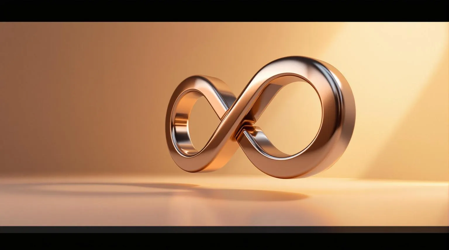
Directional lighting works like sunlight, sending parallel beams in a single direction. This setup creates bold highlights and crisp shadows, giving your logo a strong sense of depth and dimension. By tweaking the light's position and angle, you can soften shadows or make textures pop. For example, side lighting enhances surface details, while overhead lighting mimics the natural look of sunlight.
"Lighting shapes the way we see the world. In both real and fictional spaces, we use lighting to set the mood and direct attention." - Adobe Substance 3D
Point lighting radiates light in all directions from a single source, much like a traditional light bulb. This creates soft, fading shadows and highlights that draw attention to specific parts of your logo. It’s particularly effective for adding warmth and focus to your design. However, point lighting works best when combined with other types to avoid leaving large areas in shadow.
Ambient lighting provides a gentle, even glow that reduces harsh contrasts and fills in shadows across your logo. Instead of coming from a specific direction, this light ensures every detail is visible, creating a balanced and polished look. A variation called area lighting, which uses a flat light source, offers especially soft and diffused illumination. By adjusting the intensity and color temperature, you can set a wide range of tones - whether you’re aiming for a vibrant and open feel or a more subtle, refined atmosphere.
If you’re using Logo Diffusion’s 2D-to-3D conversion tool, it automatically blends directional, point, and ambient lighting for a strong starting point. Up next, we’ll dive into how the 3-point lighting setup builds on these basics.
The 3-point lighting setup is a tried-and-true method for achieving professional 3D rendering. Borrowed from photography and cinematography, this technique uses three strategically placed lights to add depth, dimension, and visual interest. As the Pluralsight Content Team explains:
"The purpose of 3-point lighting - which is used in traditional photography, cinematography, and 3D visualizations - is to properly illuminate a subject in an effective and pleasing way by simply using three separate lights."
This setup gives you precise control over highlights, shadows, and contrast, transforming flat logos into dynamic, eye-catching visuals. Let’s break down how each light in this setup plays a unique role.
The key light is your primary light source, responsible for about 75% of the illumination on your logo. It sets the overall exposure, mood, and shape of your design.
Position the key light at a 45° angle to the camera and elevate it 15–45° above the subject. This positioning enhances depth by creating soft shadows that add drama and dimension. Side lighting is particularly effective at highlighting surface textures, such as brushed metal or embossed details, helping these elements stand out. Experiment with different angles to find the perfect setup that complements your logo's features.
If the light feels too harsh, try softening it with diffusion. The goal is to achieve strong, directional lighting that defines your logo without causing distracting hot spots or overly sharp shadows. Once the key light is set, the fill light steps in to balance the scene.
The fill light serves as a secondary source, softening the shadows created by the key light. It ensures that no important details are lost in darkness. Position the fill light on the opposite side of the camera from the key light, angled toward the logo.
The intensity of the fill light is key. It should be bright enough to lift the shadows without overpowering the key light. Too much fill light flattens the image, while too little leaves details hidden in shadow. Adjust its strength by moving it closer or farther away, or by tweaking its brightness. You can also tint the fill light to reflect the environment - for instance, a warm tone works well if your logo is placed on a wooden surface.
The ratio between the key and fill lights affects the overall mood. A lower ratio creates a softer, more balanced look, while a higher ratio introduces dramatic contrast with deeper shadows.
The backlight, also known as the rim light, is essential for separating your logo from the background. Positioned behind or above the logo (out of the camera’s view), this light adds a subtle glow around the edges, ensuring the logo doesn’t blend into the background - especially when its colors are similar to the backdrop.
Carefully adjust the angle to achieve the desired effect. The backlight should not illuminate the front of the logo; its sole purpose is to create separation. Too much backlight can result in an unwanted halo effect, while too little won’t provide enough distinction.
When done correctly, the backlight enhances depth without drawing attention to itself. It’s one of those elements viewers won’t consciously notice, but they’ll feel the polished, professional touch it adds.
"Three-point lighting is a popular lighting technique because it gives utmost control of how a subject is illuminated." - Jasmine Katatikarn, Founder of Academy of Animated Art
Logo Diffusion's 2D-to-3D conversion feature integrates these 3-point lighting principles automatically, giving you a solid starting point for your designs. From there, you can fine-tune each light to match your brand’s specific look and feel. Mastering this setup is a key step in creating stunning 3D logos that stand out.
The material you select for your 3D logo plays a big role in how light interacts with its surface. Key material properties - like reflectivity, roughness, and transparency - determine how light shapes the final look. As computer graphics pioneer Phong explained back in 1975:
"In computer graphics, a shading function is defined as a function that yields the intensity value of each point on an object's body, based on the characteristics of the light source, the object, and the position of the observer."
This concept remains central to how we approach lighting and materials today. The way light behaves on your logo’s surface can make a huge difference, turning a flat design into something dynamic and eye-catching. Let’s dive into how specific materials - like metal, glass, and textured surfaces - respond to light and influence the appearance of your logo.
Metal surfaces interact with light in a way that produces sharp reflections and highlights. Their high reflectivity means they act almost like mirrors, reflecting light at precise angles. This creates bold contrasts between bright highlights and darker areas.
To make a metal logo stand out, carefully position your lights. A strategically placed key light can create striking highlights that grab attention, while fill lights soften shadows to maintain balance. Adding a backlight is especially important - it helps define the edges of the logo and prevents it from blending into reflective surroundings.
You can also control the look of metal by adjusting its roughness. Lower roughness values produce glossy, mirror-like finishes perfect for polished steel or chrome. Higher roughness levels create brushed or satin effects, where reflections are softer and more diffused.
Glass and glossy surfaces add a layer of complexity with their transparency and refraction properties. These materials don’t just reflect light - they bend it, creating unique internal highlights and refractive patterns.
For glass materials, transparency is the key setting. Full transparency gives you clear glass, while partial transparency can mimic frosted or tinted glass. These effects depend on how light bends through the material, influenced by its index of refraction - similar to how a straw looks bent in a glass of water.
Glossy surfaces, on the other hand, behave like uneven mirrors. Their tiny, irregular facets scatter light in multiple directions, creating a soft glow around highlights while still maintaining a reflective quality.
When lighting glass logos, soft, diffused lighting works best to avoid harsh glare. Position lights to encourage intriguing internal reflections, where light enters one side of the logo and exits another, adding depth. Environmental lighting also plays a big role, as glass readily mirrors its surroundings.
Textured surfaces bring a sense of realism by disrupting the way light spreads evenly. Whether it’s wood grain, fabric weave, or rough stone, textures influence how light interacts with every bump and groove.
Tools like bump maps and normal maps are great for adding surface detail without increasing the complexity of your 3D model. These maps guide the lighting system to create highlights and shadows that mimic depth and texture.
The relationship between texture and lighting is straightforward. Rough textures, like stone or concrete, handle direct lighting well without creating distracting reflections. Smooth textures, however, require more precise lighting to avoid unwanted glare.
Diffuse materials, which reflect light evenly in all directions, are especially useful for textured surfaces. They ensure consistent brightness no matter the viewing angle, making them perfect for logos that need to stay clear under different lighting setups. Adjusting the light angle - such as using side lighting to emphasize surface details or front lighting for a softer effect - can further enhance the texture.
You can also play with lighting intensity to control how pronounced the texture appears. Strong directional light deepens the shadows in grooves for a bold, dramatic look, while softer lighting creates a more subtle, polished effect.
Logo Diffusion’s 2D-to-3D conversion tool automatically applies material properties to match your design, giving you a strong starting point. From there, you can tweak the settings to achieve the exact look you want. Understanding how materials and lighting interact is key to creating a realistic and visually striking design.
Even the most skilled designers can stumble when it comes to lighting in 3D logos. These errors often arise from overly complicated setups or a lack of understanding about how light behaves in the real world. As experienced 3D artist Sushmita Roy puts it:
"3D lighting is supposed to mimic lighting situations in the real world. It helps us control the mood in a CG scene, amount of light, shadows, etc. The lighting is always based on what you are trying to express through the scene, much like with photography and filmmaking."
By recognizing common mistakes and learning how to address them, you can elevate your 3D logos to a professional level, ensuring they stand out for all the right reasons.
One of the most frequent issues in 3D logo design is over-lighting. Too much brightness can wash out important details and create harsh shadows that make text difficult to read.
The solution lies in simplicity. Tabriaz Waheed advises:
"Keep the light setup simple. There is no need to have 100s of lights in a 3D scene, when a simple HDRI and 2-3 lights can achieve the same result. Look at photographs, usually I search for photographs on products then use a black-and-white filter to see the highlights and shadows."
To fix this, start by reducing the overall light intensity. Adjust individual lights to create a balanced setup. Position them at angles that produce soft, natural shadows while maintaining depth. Soft shadows are particularly effective for logos intended for professional or indoor use.
Another helpful tip: use adjustable fixtures or dimmers in your lighting setup. This gives you precise control over brightness levels, preventing overly bright highlights that can make your logo look amateurish.
Reflections are a critical element of realism in 3D logos, but they’re often mishandled. Unrealistic reflections happen when the environment doesn’t align with the lighting setup, creating a jarring visual disconnect.
To fix this, use Image-Based Lighting (IBL) with HDRI files. As Adobe explains:
"Image-Based Lighting (IBL) uses an image to produce realistic reflections and ambient lighting in a 3D scene. It gives subtle lighting effects that help make the objects appear as though they naturally belong in an environment."
Additionally, pay attention to material roughness values. Lower roughness values create sharp, mirror-like reflections, while higher values result in softer, more diffused reflections. Adjust these settings to harmonize with your lighting for a more cohesive and believable look.
If you’re using tools like Logo Diffusion’s 2D-to-3D conversion feature, take time to fine-tune how the applied materials interact with your lighting. This ensures reflections enhance your logo’s design rather than distracting from it.
Shadows play a key role in adding depth and grounding your logo in its environment. Poorly defined shadows, however, can make even the best designs look unpolished.
Start by increasing render quality and smoothness settings in your 3D software. This helps eliminate pixelated, unrealistic shadows. Adjusting shadow resolution can also make a noticeable difference - don’t hesitate to bump it up for your final renders.
Avoid completely black shadow areas, as real-world shadows often contain subtle variations and reflected light. Use fill lights or ambient lighting to brighten shadowed areas just enough to add realism without erasing them.
For logos with text, position your light source carefully to ensure shadows enhance legibility. Shadows should define the letterforms, not obscure them. Experiment with different angles and intensities until you strike the right balance.
Finally, remember that soft shadows generally look more polished than sharp, hard edges. Larger light sources or diffusion techniques can help you achieve the smooth gradients that give your logo a professional touch.
Setting up traditional 3D lighting has always been a tricky and time-consuming process. But now, AI-powered tools are stepping in to simplify things, automating many technical tasks while still leaving room for designers to make creative decisions.
The AI Image-to-3D market is expected to hit $1.37 billion by 2032[1], driven by the increasing demand for easy-to-use 3D design tools. Part of this growth comes from platforms that handle the complex lighting calculations once reserved for experts. This shift is making high-quality 3D logo creation faster and more accessible.
AI is taking traditional lighting techniques and speeding them up without sacrificing creative control. Take Logo Diffusion, for example. Its 2D-to-3D conversion feature removes much of the hassle of setting up lighting. The platform uses AI to automatically fine-tune depth, shadows, and lighting to give your logo a polished, professional 3D look. This allows designers to focus on the artistic side instead of getting bogged down in technical details.
The process is simple: upload your logo to Logo Diffusion, and the AI takes care of the rest. It analyzes the structure, colors, and style of your design and applies the best lighting setup for your needs. Compared to traditional 3D workflows, which can take hours, this platform cuts the setup time drastically. It even generates multiple lighting options in just minutes, giving you the flexibility to experiment with different moods and styles.
What’s more, you can export your AI-enhanced designs to tools like Blender, Maya, or Cinema 4D for further customization. While the AI handles the heavy lifting, you can still refine the finer details in your preferred software. Logo Diffusion doesn’t just save time - it also offers advanced lighting controls for designers who want to tweak their creations further.
Logo Diffusion’s user-friendly controls make managing complex lighting effects much easier for designers at any skill level. You can fine-tune colors and backgrounds, and the AI automatically adjusts shadows, reflections, and depth based on your preferences.
One standout feature is style transfer, which lets you apply the look of any image to your logo. For instance, choosing a "hyperrealistic" style will enhance shadows and reflections, while an "embroidered" style creates softer, diffused lighting, perfect for logos with textile-like textures.
Here are some of the platform’s most practical lighting tools:
Logo Diffusion also excels at simulating materials like metal, plastic, and glass. For example, metallic surfaces get sharper reflections and highlights, while glass is rendered with realistic transparency and refraction effects.
Need something more specialized? The platform can create realistic 3D neon shapes, complete with glow effects, color bleeding, and environmental reflections. It automatically calculates the intricate lighting interactions that make neon designs pop.
Additionally, the upscaling feature doesn’t just boost resolution - it also enhances lighting and texture details. When you upscale a design, subtle elements like lighting nuances and fine textures become more pronounced, giving your logo an even more polished appearance.
With over 250,000 users relying on it, Logo Diffusion is proving to be a game-changer in 3D lighting. It removes the steep learning curve of traditional software, making it easier than ever to achieve professional-quality lighting effects.
[1] Source: RAG data on the worldwide AI Image to 3D Generator Market.
Lighting can take a flat, uninspired logo and transform it into something that truly stands out, making a lasting impression and strengthening brand identity. As we've discussed, the right lighting techniques can add depth, emotion, and a polished, professional edge to your 3D logo design.
By applying the principles we've covered - like directional, point, and ambient lighting, or the three-point lighting setup - you can elevate your designs significantly. Each type of material, whether metal, glass, or textured, requires a tailored lighting approach to achieve realistic and visually striking results. These details make all the difference in creating a logo that catches the eye and communicates your brand's personality.
Well-lit 3D logos are especially effective in digital spaces, where visuals compete fiercely for attention. A thoughtfully designed logo with proper lighting not only enhances visual appeal but also helps your brand stand out, boosting recognition and marketing success.
Tools like Logo Diffusion simplify this process by combining advanced 2D-to-3D conversion features with intelligent lighting controls. These AI-powered solutions streamline complex tasks while allowing you to maintain creative oversight, making it easier to achieve professional results.
Whether you're working with traditional design software or leveraging AI tools, the key is to start small, observe how light interacts with the world around you, and build your skills over time. By mastering these lighting techniques, you'll create logos that don't just look great - they'll also deliver meaningful business results.
Ethan Brookes is a product-focused content writer covering AI tools, branding, and SaaS workflows. He writes practical guides on using AI for real-world design and product use, with a focus on brand-ready outputs and scalability.


.webp)

.webp)
.webp)