.webp)
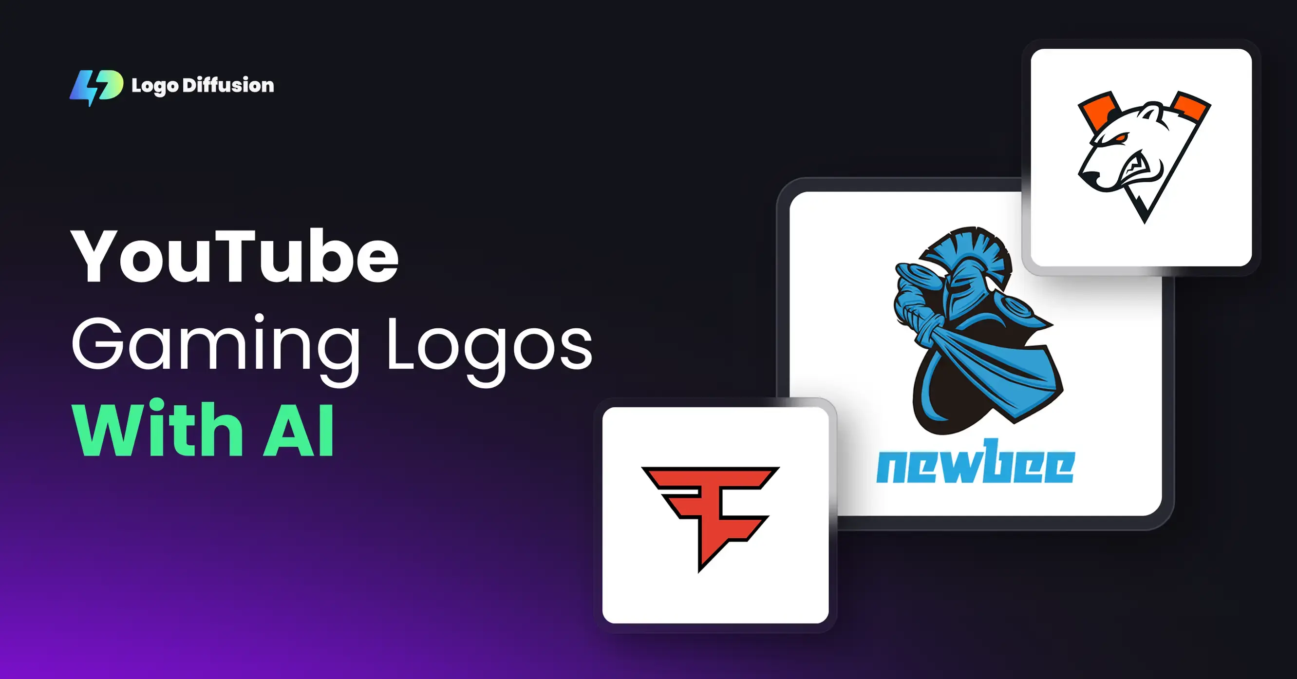

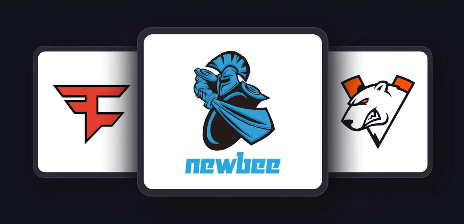
Most gaming logos are bold, energetic, and designed to stand out even when they’re tiny. On YouTube, people usually see your icon at the smallest size first — in comments, recommended videos, and mobile feeds — so the design needs to read instantly.
Strong shapes, sharp outlines, and good contrast help gaming logos stay recognizable. Many gaming creators also use characters, creatures, weapons, or symbols that match their channel personality. The goal is simple: the logo should feel dynamic and memorable at a glance.
Here are a few styles that show up often in the gaming space:
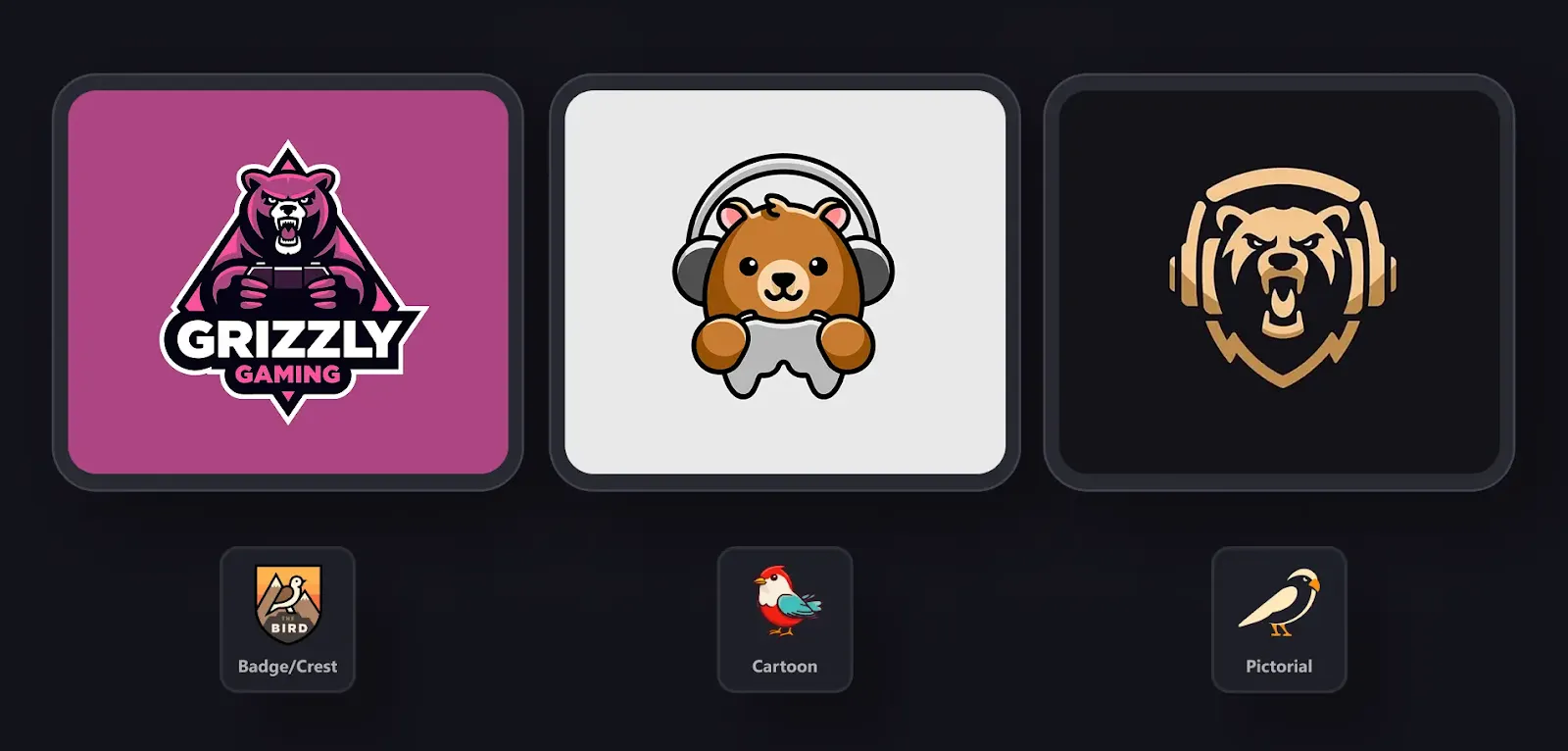
Mascot
Characters with expressive faces and clear silhouettes. Wolves, dragons, robots, warriors — anything that gives the logo personality.
Typography
Bold, stylized text builds the logo. Inspired by esports teams or competitive gaming brands. Works well when you want a strong name-first identity.
Cartoon
Soft lines, expressive shapes, and friendly characters. Great for casual or light-hearted gaming channels.
Badge / Crest
Emblem-style layouts where the icon, text, and shape feel unified. Works when you want something clean, structured, and complete.
Logo Diffusion can generate all these styles quickly, letting you test different directions without redrawing anything manually.
How to create YouTube logos & YouTube logo styles
In Logo Diffusion, the first thing you do is pick a style. After that, the prompt can be as short or as detailed as you want.
You can:
• Keep it simple, like:
“Logo for a competitive FPS gaming channel.”
Then let the prompt enhancer expand it, add mood, color direction, and style details to turn it into a proper prompt.
• Or be specific, if you already know what you want:
“Logo for esports team called Lycan Gaming showing a fierce wolf wielding a game controller, radiating digital energy, green, brown, and black color palette.”
Here’s a simple structure that works well for gaming prompts:
• What the logo is for (gaming channel, streamer, team)
• The main subject (animal, character, object, weapon, symbol)
• The vibe (vintage, clean, dynamic, modern, stylish, playful)
Example idea (before enhancement):
“Logo for a competitive wolf-themed gaming channel.”
From there, the enhancer and style settings take over and build a strong base. If you want more control over specific parts — the eyes, the weapon, outline thickness, or colors — you can refine the text or tweak settings as you go.
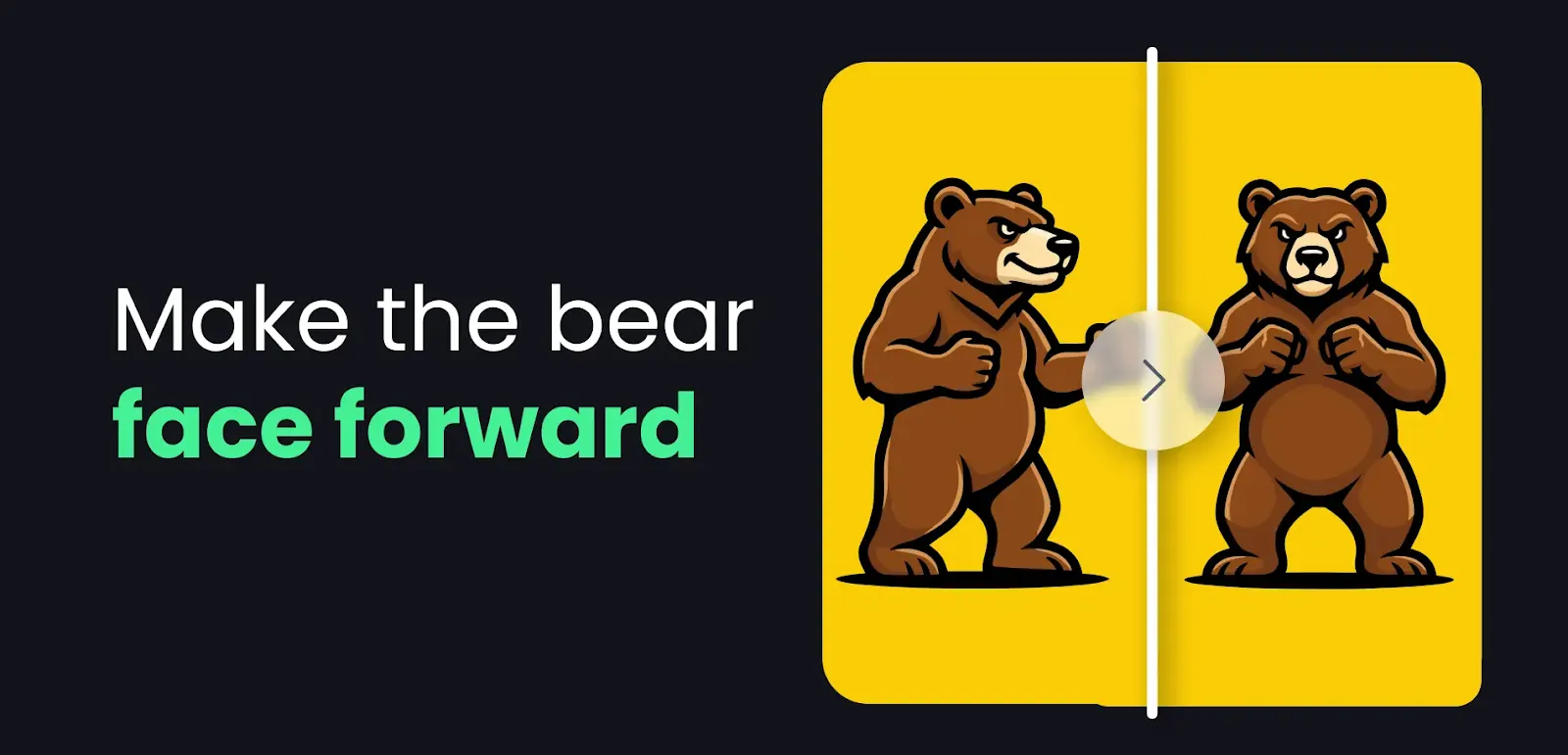
Once you pick a design you like, you might want to fix small details or change specific elements. Magic Editor is perfect for that because it edits only the part you ask for while keeping the rest of the logo perfectly intact.
You can:
• change the character expression
• adjust the eye shape or glow
• swap colors
• change the text or name
• tweak proportions
• remove or add small details
• fix a shape that feels off
It rebuilds the edited area in the same style, so the logo stays consistent.
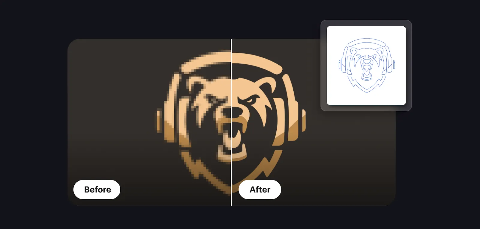
When you’re happy with your result, run it through the vectorizer. This turns the logo into a clean, editable file that behaves like a real design asset. Vector files scale perfectly, which is important if you plan to use your logo on:
• overlays
• intros
• banners
• merch
• social icons
• animated stingers
Check a good guide on vectorizing here
If you’re not sure where to start, you can use a simple universal prompt like:
“Logo for a dynamic gaming channel called Lycan Gaming.”
Then choose the style inside Logo Diffusion (mascot, badge, cartoon, monogram, etc.), to see how your idea works across different directions. If you don’t want a name yet, remove it and keep the concept only.
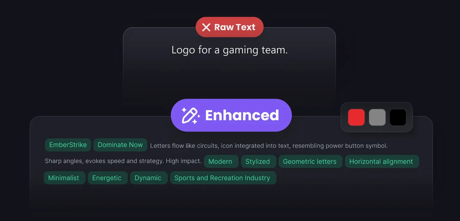
Gaming prompts benefit a lot from clarity. This shows the difference:
Simple Prompt:
“Logo for a gaming team.”
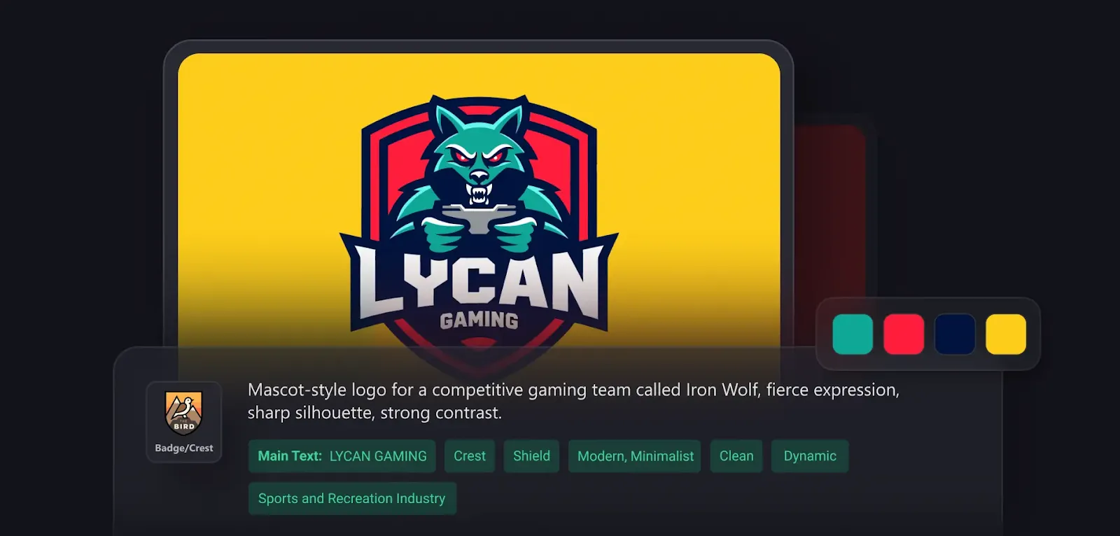
Enhanced Prompt:
“Mascot-style logo for a competitive gaming team called Iron Wolf, fierce expression, sharp silhouette, strong contrast.”
Competitive Mascot:
“Logo for an aggressive wolf-themed gaming channel called Frost Bite.”
Cartoon Gamer:
“Cartoon-style logo of a playful raccoon holding a controller for a casual gaming channel.”
Badge / Crest:“Badge-style logo for a team called Shadow Unit with a simple symbol and clean layout.”
More ideas can be found here.
Ethan Brookes is a product-focused content writer covering AI tools, branding, and SaaS workflows. He writes practical guides on using AI for real-world design and product use, with a focus on brand-ready outputs and scalability.


.webp)

.webp)
.webp)