Magic Editor: Precise Logo Edits with Redrawing Anything
August 24, 2025
Branding
Logos aren’t just pictures. They’re systems. Change the word in a stylized wordmark, swap a mascot’s accessory, or replace an icon, and you can throw the whole system off—unless you do it surgically.
Magic Editor is that surgical tool. It lets you revise logos inside their original style so the result still looks designed on purpose, not pasted in. You keep the look. You change the parts.
Below is a clear look at what it does, where it shines, and how to get pro-level results in minutes.
What Magic Editor actually does
Magic Editor is built to edit inside context. Instead of asking you to rebuild a logo from scratch, it understands the visual rules already in the artwork, line weight, shading, perspective, letterforms, materials and applies your edit so everything still fits.
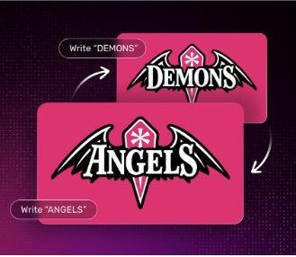
Demons → Angels: Text replacement inside a custom wordmark while preserving style and structure. The new word reads like it always belonged there.
Super Dad → Mega Mom: Another text swap in a different badge format, again matching the existing letter style and composition.
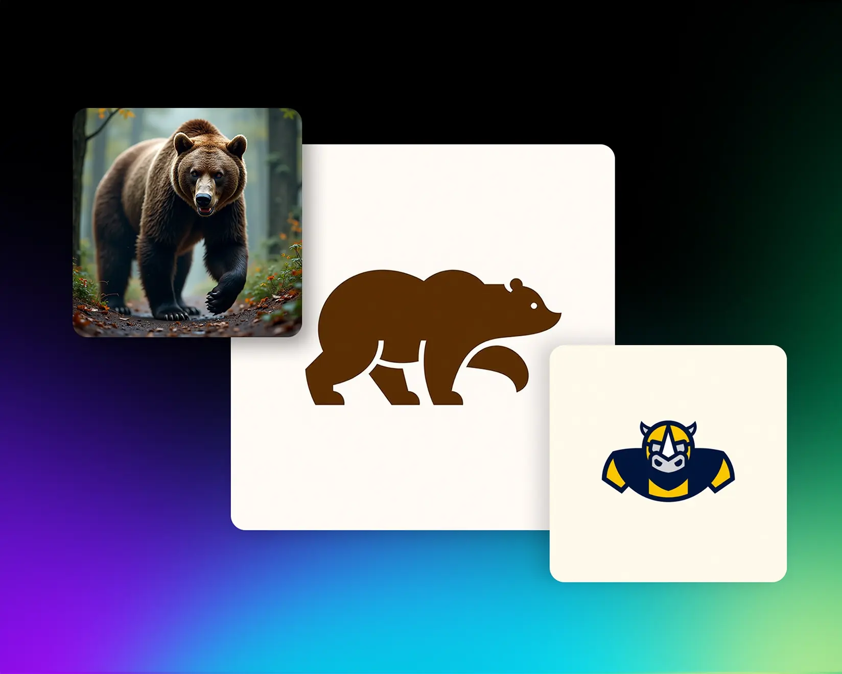
Bear → Dog, Chair → Throne: Object replacement (two changes in a single edit). It shows Magic Editor is just as reliable for illustrated elements as it is for text.
Bowler Hat → Cool Cap: Fine-detail tweak to a mascot. Small accessory changes are handled precisely without breaking the illustration’s look.
Those four patterns: text edits, single-object swaps, multi-object swaps, and micro-tweaks, cover most real-world logo revision requests.
When to reach for Magic Editor
Renaming without redesigning. Your team picks a new club name or product line. Update the wordmark while keeping the brand’s styling intact.
Localized variants. Create regional versions of a league or event logo without commissioning a redraw.
Campaign add-ons. Add a seasonal prop to a mascot, or generate a limited-edition badge variation.
Client feedback loops. That “quick change” at the 11th hour no longer means a total redo.
Why it’s different from quick-fix tools
Basic “overlay text” or stamp-style editors ignore the rules of the original asset. You end up with mismatched letter shapes, inconsistent outlines, and lighting that fights the rest of the art.
Magic Editor learns from the logo itself, then conforms your change to the same rules:
Material feel (flat icon vs. glossy emblem vs. textured patch)
The edit looks like it was drawn that way from day one.
Quick workflow (repeatable)
Import the logo
Use the highest-quality source you’ve got. Vector exports are ideal; clean PNGs also work well.
Select the change
Text swap (e.g., DEM0NS → ANGELS or SUPER DAD → MEGA MOM).
Object swap (e.g., bear → dog, chair → throne).
Detail tweak (e.g., bowler hat → cool cap).
Describe the intent, not the recipe
Tell Magic Editor what you want to change and what should stay the same:
“Replace ‘Demons’ with ‘Angels’ in the same style, spacing, and outline.”
“Swap the bear for a dog puppy, same pose and line weight. Replace chair with a throne that matches the badge.”
Review and refine
If spacing or kerning feels tight, re-run with a note like “slightly wider spacing” or “match baseline to original.”
For objects, mention scale relationships: “Dog size relative to throne unchanged.”
Export properly
Download ready-to-use SVG/EPS for print and transparent PNG/WebP for digital. Keep a master vector in your files so future edits stay clean.
Best-practice tips
Work from the master: edits compound better when you start from the original logo rather than an exported social graphic.
Mind contrast: if the logo sits on a dark background, ask Magic Editor to preserve the original highlight/outline system.
One variable at a time: if an edit involves a rename and a prop change, do the text first, then the object. The system reads structure more reliably that way.
Keep brand rhythm: if the wordmark originally used small-caps or exaggerated ascenders, name the replacement in a matching letter rhythm (“Use small-caps feel; keep tall A and L”).
Approve at print size: zoom to 100% and check edges, corners, and counter-forms. If it looks clean on paper, it’ll sing on screen.
Where teams save the most time
Sports and clubs: season updates, opponent badges, commemorative patches.
E-commerce and merch: holiday variants, influencer collabs, limited drops.
Agencies: speeding up concept iteration without sacrificing craft.
Franchise/retail: location-based variants that still feel unified.
Your examples already show the range: stylized wordmarks, badge logos, mascots, and small detail changes that used to eat half a day of vector nudging.
What you ship at the end
On-brand edits that match line work, style, and materials
Vector files that scale to signage and embroidery
Consistent variants for campaigns, regions, or seasons
Faster approvals because the logo still “feels like us”
The whole point: editing the brand system, not just the pixels.
Try it on something real
Start with a simple test: rename a wordmark in place. Then do a detail tweak on a mascot (swap a hat or add a prop). Once you see those two work, multi-object swaps feel easy.
If your team spends more time maintaining logos than creating them, Magic Editor puts that time back in your week—without lowering your standards.


.png)