The Amazon logo is one of the most recognisable brand marks in the world, and for good reason. The simple ‘smile arrow’ delivers a powerful message: Amazon offers everything from A to Z and aims to make customers happy along the way. From a design perspective, the amazon prime logo is a masterclass in clarity, memorability, and strategic symbolism–exactly the kind of thinking we champion at LogoDiffusion with our AI-assisted logo creation.
Bezos himself said, “Brand names are more important online than they are in the physical world” in an interview with Bill Murphy Jnr, and part of a memorable brand name is a logo that is not only instantly recognisable, but tells the right story. So what makes the Amazon symbol so good?
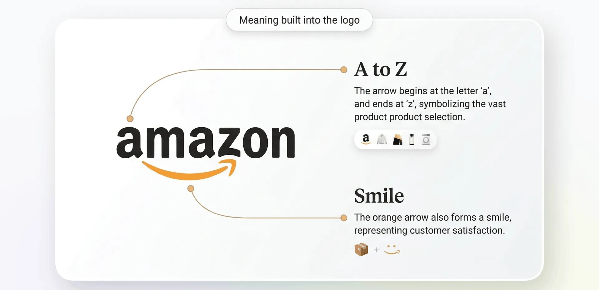
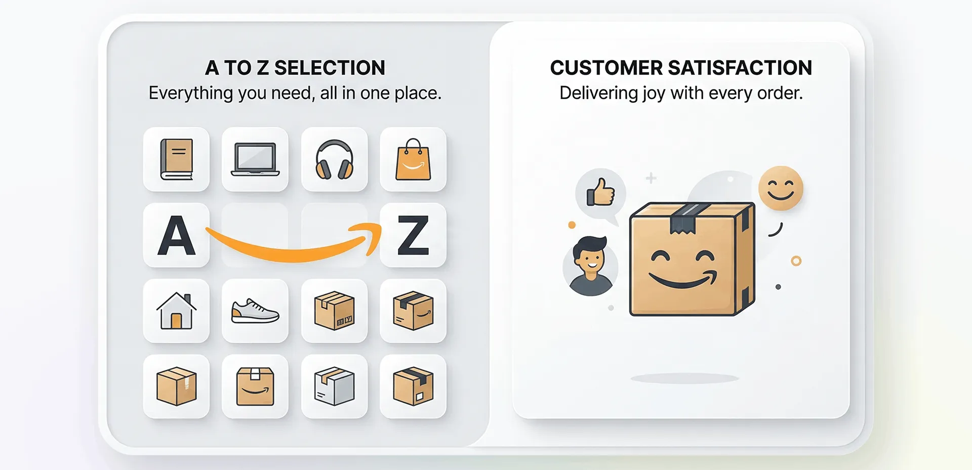
The arrow represents Amazon’s ‘A to Z’ product range
It doubles as a smile to suggest customer satisfaction
The logo works at every size, from app icons to packaging
Its simplicity makes it timeless and scalable
Small businesses can learn from the clarity of the Amazon app logo without copying it.
Amazon is a trademark of Amazon.com, Inc. This article is educational and not affiliated with Amazon.
What Does the Amazon Logo Mean?
At its core, the Amazon logo meaning communicates two ideas: range and delight. The curved arrow stretches across the Amazon logo A to Z, indicating that the company sells practically everything and delivers in the same way. It also forms a friendly smile, an emotional cue that reinforces the convenience, ease, and a promised positive customer experience.
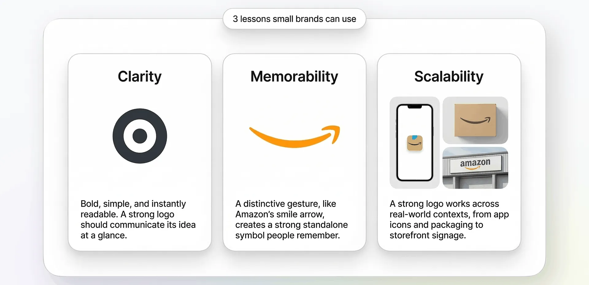
Three Takeaways for Small Brands
Clarity wins: A symbol should communicate an idea instantly
Memorability matters: A simple gesture (like a curve or an arrow) sticks in the mind
Scalability is essential: Your logo must work on screens, packaging, and tiny icons
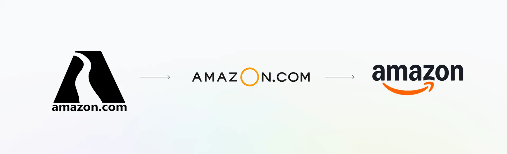
A Quick History of the Amazon Logo
Mid-1990s: The Amazon original logo was a simple, abstract A, featuring a river. Basic, maybe, but a bit too visibly complex, so it was challenging to reproduce in smaller sizes. Following this, the team focused on wordmarks in various fonts and sizes,
Late 1990s: The Turner Duckworth design agency was hired to make a more robust identity for the company, starting with the curved ‘swoosh’ below the wordmark. This demonstrated dynamism, but was considered to be a little too simplistic
2000: Asked to improve the swoosh, Turner Duckworth came up with the ‘smile arrow’ as the primary brand device, forming the foundation of the modern presentation, the recognisable smile logo of Amazon.
2000s-present: refinements in colour, spacing, and typography have occurred, but the core smile arrow concept remains unchanged.
It is this consistency that has helped Amazon build one of the strongest brand identities in the world.
Why the Smile Arrow Works
For those interested in the Amazon logo from a design analysis perspective, the Amazon logo works because it uses a single, strong shape (a simple curved arrow) to serve multiple purposes–pointing, smiling, and visually anchoring the Amazon typography.
The curve of the arrow softens the design, making a global tech giant feel approachable.
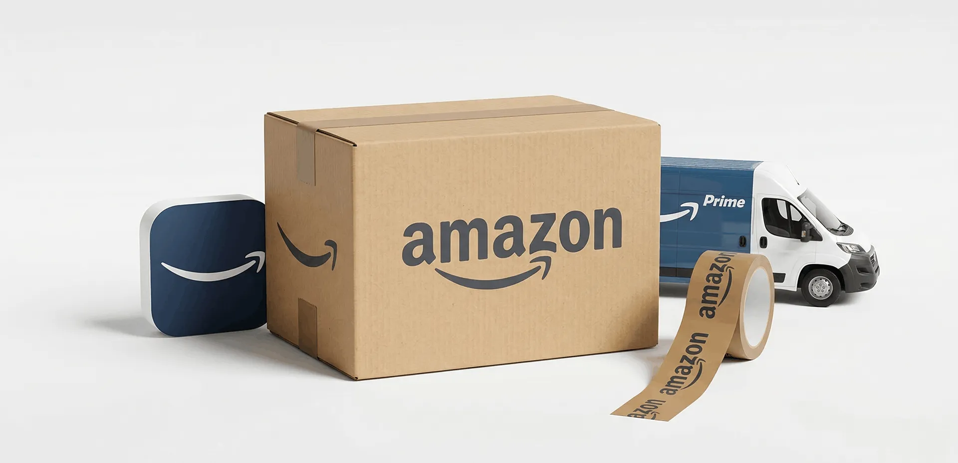
It works on multiple scales, whether as the Amazon app logo or a delivery truck, remaining crisp and recognisable.
The smile arrow itself is a brand design that works as a standalone asset, on boxes, tape, and digital, which really is a hallmark of great identity design.
Colour and Typography Lessons (What You Can Copy Ethically)
You obviously cannot copy the Amazon DSP logo, but you can learn from its design principles.
Contrast: the Amazon logo colours of black wordmark with a warm orange arrow creates a visual hierarchy
Readability: clean, modern typography is easy to read at any size.
Tone: Selected colours balance professionalism in the black with friendliness in the warm orange.
Can You Use The Amazon Logo?
In short, no.
You should not recreate, edit, or use the Amazon icon logo in any way that suggests partnership, endorsement, or affiliation. That includes using modified versions, similar arrows, or smile-like curves that mimic the original.
If you need to reference Amazon in a legitimate context, such as selling on Amazon or writing documentation, then you should use only the official brand assets provided through Amazon’s approved channels and follow their brand guidelines strictly.
5 Logo Lessons You Can Apply Without Copying Amazon
Build a promise into your symbol. You want it to reflect your value proposition.
Use a single, memorable gesture. Maybe not a curve or an arrow, but perhaps something like negative space could become your signature.
Prioritise the silhouette. A great logo works on one colour and remains recognisable from a distance.
Design for all systems. This is about icons, app buttons, social avatars, packaging - they all matter.
Keep the meaning simple. If you cannot explain the idea in one sentence, it is too complicated.
How to Create an Original E-Commerce Logo with LogoDiffusion
At LogoDiffusion, we help brands create distinctive, non-infringing logos that communicate clearly and scale with ease.
Step1: Define your brand in three simple adjectives
Examples: experienced, fast, friendly, reliable, premium, minimal, modern
Step 2: Pick a unique symbol idea
Explore simple shapes that reflect your own story. These might include motion lines, abstract delivery symbols, geometric boxes, or negative space concepts. It is important to remember that it needs to be easy to recognise.
Minimal arrow icon that suggests fast delivery, abstract, geometric, no smile, no A-to-Z, bold monochrome.
Friendly e-commerce logo with a curved line and box motif, simple vector, unique shape, modern, high contrast.
Abstract ‘motion’ symbol for online shop, clean negative space, flat vector mark, distinct silhouette.
Conclusion
There is a reason the Amazon logo is considered a masterclass in simple, strategic branding. It embodies emotional warmth alongside clarity and scalability, which should be a valuable lesson for any small business looking to build an instantly recognisable brand.
By focusing on what your promise is, choosing one memorable element, and ensuring that your logo will work at any size, you will be able to build something that can grow with your brand–and when you are ready, LogoDiffusion will make the process intuitive, inspiring, and simple.
FAQ
The arrow represents Amazon’s promise to offer products from A to Z and reinforces movement, speed, and completeness, which are key ideas for an e-commerce brand.
The arrow doubles as a smile, suggesting customer satisfaction. This emotional cue helps humanise the brand and makes the logo feel friendly rather than purely functional.
The arrow with a smile concept became central to Amazon's identity in 2000, when the company first introduced the modern version of its logo.
No. Using Amazon’s logo without permission can imply endorsement and may violate trademark rules. Always use official assets only when Amazon specifically allows it.
You must avoid creating anything that could be confused with Amazon’s logo. Similar arrows, smile curves, or A-to-Z concepts can create legal and brand-confusion risks. Aim for originality.
Clarity, simplicity and emotional resonance–Amazon’s logo shows how one well-designed gesture can communicate function and feeling.
Start with your brand promise, then explore shapes that subtly express it. The meaning should be simple enough to explain quickly.
LogoDiffusion guides you through defining your brand, generating unique concepts, and refining them into a scalable, professional identity–without copying or referencing protected trademarks.


.webp)

.webp)
.webp)