If you are looking for an enduring and recognisable logo styles in branding, you might want to consider an emblem logo. They combine text and imagery inside a contained shape (often a circle, crest, shield, or badge) to create a unified mark that feels structured, intentional and instantly memorable. In simple terms, an emblem logo is a fusion of typography and iconography inside a frame.
This style remains popular because it communicates trust, heritage, and a sense of community. Whether you are looking at a vintage emblem logo for a brewery or a modern emblem logo for a gym, the format naturally feels like a stamp of authenticity. It’s why so many cafes, sports teams, craft brands, and schools rely on them.
In this guide, you’ll learn what an emblem logo is, why it works, how to design one that scales and how to create your own using a simple LogoDiffusion workflow. You’ll also see emblem logo examples, design tips, and prompts you can use immediately.
What is an Emblem Logo?
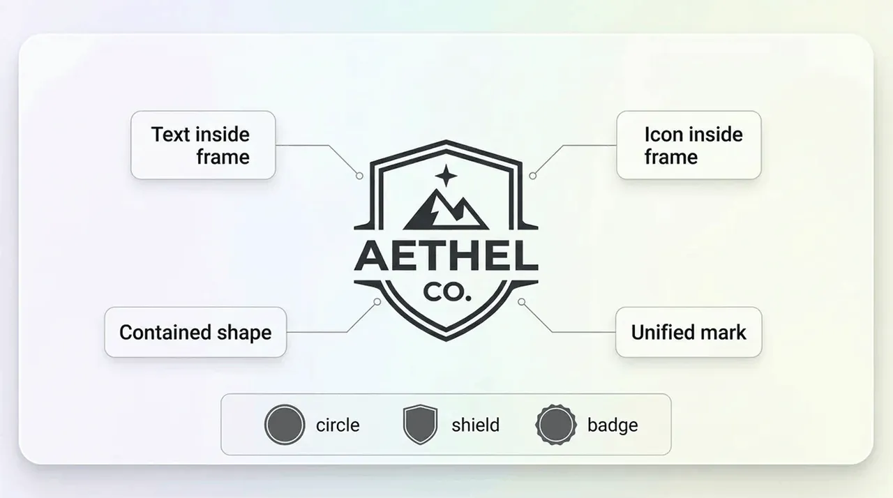
An emblem logo is a logo in which text and imagery are combined within a simple, enclosed shape. Instead of placing a symbol alongside a wordmark, everything is fused into a single container, like a shield or a badge. This gives the logo a compact, unified appearance.
The emblem logo's meaning is tied closely to the idea of belonging and authority. With a format that resembles traditional seals, patches, and institutional marks, an emblem naturally communicates authority, tradition, community and quality. They can be similar to official seals or government insignias and reminiscent of club badges and sports emblems, with a structure and format that feels both classic and established, designed with craftsmanship and care.
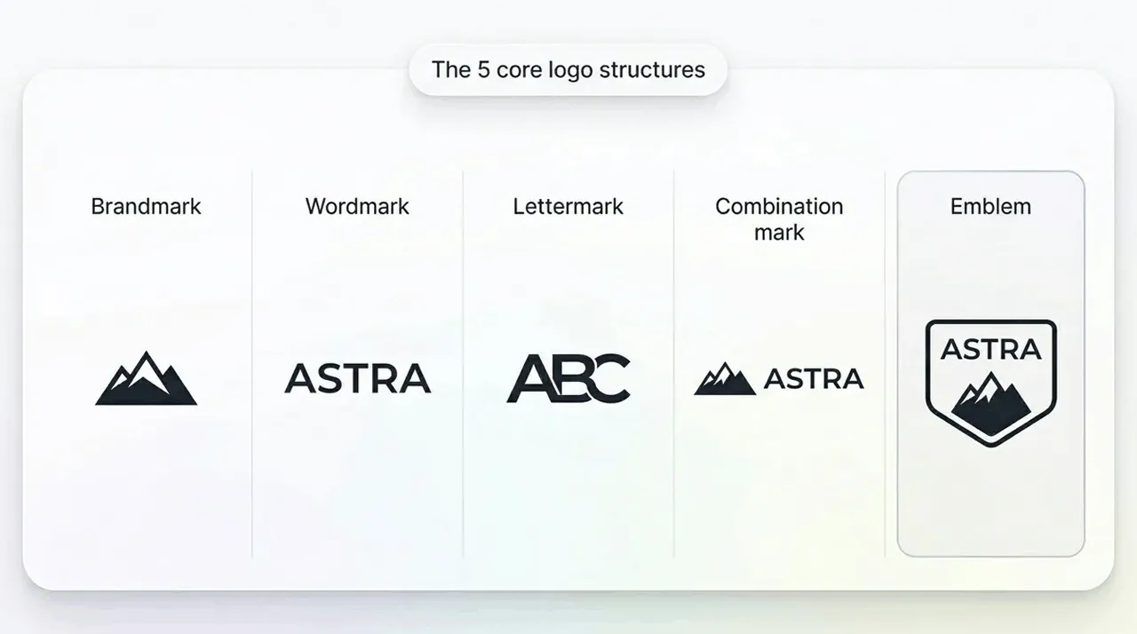
The 4 Basic Logo Types
To broaden your understanding of logos, it is helpful to know how emblems fit in the broader landscape of logo types.
Brandmark (symbol) - a stand-alone icon with no text
Wordmark - a text-only logo using stylised typography
Lettermark - initials or monograms used as a primary mark
Combination mark - symbol and wordmark placed side by side
Emblems sit in their own category because they are not side by side or separate. They’re contained, meaning the tet and imagery live within a single unified shape. This is what distinguishes emblem vs logo mark styles: a logo mark is usually free form, while an emblem is framed.
So, What Makes an Emblem Logo Different?
The defining trait of an emblem logo is that everything is inside a frame. This container can be:
A circle
A shield
A crest
A seal
A rectangle
A badge shape
This is why emblem logos often resemble badges, stamps, or patches. They rely heavily on logo container shape, logo border design, and balanced internal structure.
Pros of Emblem Logos
Strong sense of identity and heritage
Great for merchandise, patches, packaging, and signage
Feels cohesive and instantly recognisable
Works well for community-driven brands
Cons of Emblem Logos
Can struggle at very small sizes
Long brand names can feel cramped
More detail means more risk of losing clarity
Compared to combination marks, emblems are more unified but less flexible at tiny scales.
Emblem vs Symbol: What’s the Difference?
A symbol (brandmark) is a stand-alone icon. Think of the Nike ‘tick’ or the Amazon ‘smile’. It doesn’t rely on text and can be used independently at any size.
An emblem includes both icon and text, but they are fused inside a container.
This matters because:
Symbols scale better. They stay readable even at 16 or 32px.
Emblems need more space. Small details can disappear.
Symbols are more minimal, making them ideal for tech and app-first brands.
Emblems communicate more, so they are ideal for heritage, craft and community brands
This distinction is also part of the emblem vs badge logo conversation. A badge logo is a type of emblem, but not all emblems use a decorative badge outline.
Where Emblem Logos Work Best (and Where They Struggle)
Best for:
Cafes and restaurants
Breweries and distilleries
Barbershops
Gyms and fitness clubs
Sports teams
Schools and universities
Heritage brands
Handmade and craft businesses
These industries benefit from the ‘badge of belonging’ feeling that an emblem naturally creates.
Not great for:
Minimal tech brands
Apps that need a tiny icon first
Brands with long names
If your primary use case is a favicon or an app icon, a minimalist emblem logo might still work, but only if it is extremely simplified.
Emblem Logo Design Tips
Pick the Right Container Shape
Your container sets the tone before anything else. The logo container shape is the backbone of the design.
Circle/oval - friendly, classic, stamp-like
Shield/crest - heritage, authority, tradition
Rectangle/badge - modern, structured, versatile
Simple Rule: Choose a shape that matches your brand personality and will scale cleanly. You will want to avoid overly complex outlines.
Keep the Text Short
Don’t try to add extra words, like slogans or taglines, as this usually leads to cramped, unreadable text. Remember you already have limited space inside the container.
Short brand names work best
Avoid curved text that becomes tiny
If you must include a slogan, use it only in large formats
This is especially important for emblem logo typography, which needs to remain bold and readable.
Choose Colours Carefully
Colour is important, but clarity is more important, so look into contrast first.
Stick to 2-3 colours
Prioritise a strong contrast between text and background
Use simple palettes for a timeless look
Avoid gradients unless they are extremely subtle
This is the foundation of creating strong emblem logo colours and ensures your design remains scalable.
Design For Readability at Small Sizes
This is where most emblem logos fail.
Avoid:
Thin lines
Tiny illustrations
Overly decorative borders
Too many layers of text
Use the favicon test. Shrink your logo to 32px. If it becomes a blob, it needs to be simplified. This is the heart of scalable logo design–clarity over decoration.
Build a Flexible System
A great emblem logo isn’t just one file; it is a system. You need to include:
Primary emblem (full badge with text and icon)
Simplified mark (icon only or initials only for tiny uses)
One-colour version (for stamps, merchandise, and engraving)
This ensures your brand stays consistent across every platform, from packaging to social media.
When to Choose an Emblem Logo
Choose an emblem logo if:
You want a badge or stamp that communicates trust
You're building a community identity (such as for a club or a team)
You want something that looks great on merch or packaging
You’re a small business looking for a strong identity (emblem logos for small-business use cases are extremely common).
Avoid an Emblem Logo if:
Your brand name is very long
You need app-icon-first simplicity
Your style is ultra-minimal and text-led
If your brand seems to fall somewhere in the middle, you can always create both an emblem and a simplified symbol to make it work.
How to Create an Emblem Logo with LogoDiffusion
Step 1: Choose the Brand Adjectives and How it Should Feel
You already know what your brand does, and what adjectives you would use to describe it. So now you need to decide whether your emblem should feel heritage, modern, sporty, vintage, or minimal. This sets the tone for shapes, colours, and typography.
Step 2: Pick the Container Shape and Core Symbol Idea
There are only so many shapes that work as an emblem, so choose a simple shape. Most would use something like a circle, shield, or badge, and a central icon that represents your brand. Remember to keep the icon minimal.
Step 3: Generate 8-12 Variations
Use LogoDiffusion to explore multiple layouts, type treatments, and border styles. Don’t settle on the first result, because emblems benefit from iteration. Don’t forget that you need to make sure that you are not using any symbols or fonts that are licensed elsewhere.
Step 4: Refine
When you are refining, you are looking for ways to improve such as reducing unnecessary detail, increasing contrast, simplifying borders, and improving text hierarchy. You want to concentrate on clarity, not decoration.
An emblem logo is a design where text and imagery are combined inside a single enclosed shape. Something like a circle, shield, or badge. Putting the design together like this makes it unified structured and intentional. Emblems are especially popular for brands that want a classic or community-driven identity.
A badge logo is a type of emblem logo. All badges are emblems, but not all emblems use a badge-style outline.
Yes, especially for cafes, barbers, craft brands, and local community shops. They need to be simple so that they can scale well.
Emblems resemble historial seals, crests, and institutional marks, which naturally carry a sense of heritage. Even modern emblems feel rooted in history because of their badge-like format and balanced composition.
Most emblem logos work best with two or three colours. This keeps the design clean, high-contrast, and easy to reproduce across print and digital formats. Too many colours make it too busy feeling.
Absolutely. While some emblems can be more vintage and detailed, you can create a minimalist emblem logo by suing simple shapes, bold lines, and clean typography. The key is to keep it uncluttered.
Keep the design simple with thick lines, high contrast colours and minimal detail. Avoid using too much text or intricate illustrations. The emblem should be tested at a range of sizes to ensure it is legible.
Emblem logos are a wonderful way to communicate a brand by combining the structure, clarity and personality of a wordmark and letterform based icon into a single expression.
A well designed logo scales up consistently, Projects : logo’s give credibility, connection to heritage and communicate the sense of community that your organisation embodies. Whether you are after a modern interpretation of your name as a badge, or something a little more nostalgic as a seal, great logo design is simple and has strong contrast.
With LogoDiffusion you can rapidly generate variations on the logo, refine the best one and export a cleaned up SVG emblem logo that will work on any platform. It is one of the easiest ways to generate a high quality emblem logo.

.webp)


.webp)

.webp)
.webp)