Types of Fonts: The Practical Guide to Font Styles (and How to Choose One for Your Brand)
April 9, 2026

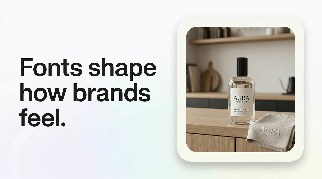

Choosing the right typography is one of the most powerful (and overlooked) branding decisions you can make. Different font types instantly communicate tone, personality, and professionalism. However you are trying to enhance your brand, if you can work on understanding font types, styles, and typography basics it will help you make confident, strategic choices rather than relying on trends or guesswork.
Fonts influence how people feel about your brand before they read a single word. They shape trust, readability, and emotional impact. This guide breaks down the six main font categories, explains essential terminology, and shows you how use your brand personality to choose a font, from modern font styles to vintage font styles, and from minimalist fonts to expressive scripts.
Font types are broad categories that group fonts by shared design features. They matter because each type communicates a different tone–modern, classic, playful, premium–which directly shapes your brand identity and logo typography.
Quick Notes:
Whatever font you choose, make sure it’s readable, scalable, and legally licensed for commercial and logo use–especially when dealing with font licensing for logos.
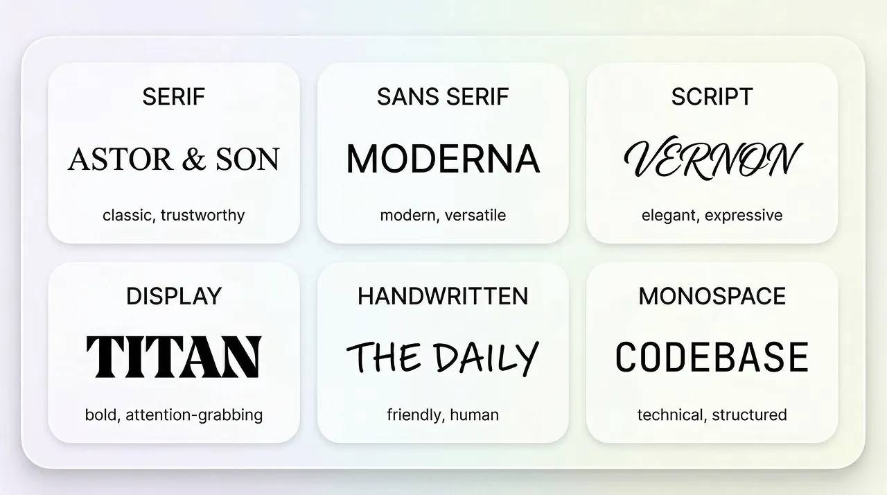
Most font styles fall into six core categories.These can communicate specific types of tone.
The six main types of fonts:
Best uses
Today’s brands live across dozens of touchpoints–websites, apps, packaging, social media, email, video, and even AI-generated content. Because of this, typography has become one of the most consistent and recognisable elements of a brand’s identity. A strong font choice helps you stand out in crowded feeds, improves user experience, and builds trust faster than almost any other design element.
The right font choice is a real strategic advantage. Attentions spans are short, so people need to have the information they need available to them clearly and quickly. There are a lot of brands out there, and uniqueness will help you stand out.
Don’t forget that logos themselves are shrinking; they ended to be crisp at app icon sizes as well as billboards.
And by choosing the right font, you can avoid the idea of your work being automated by AI, rather than intentional.
This is exactly where tools like LogoDiffusion shine. They help you explore typography directions quickly, refine spacing and weight, and generate polished wordmarks that feel custom rather than templated.
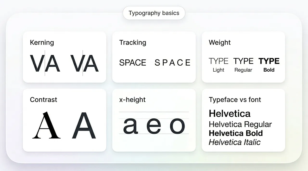
A typeface is the design family (eg, Aptos)
A font is a specific style within that family (eg Aptos Bold)
How thick or thin the strokes are–light, regular, bold, etc.
The vertical spacing between lines of text
Overall spacing between letters across a whole word or paragraph.
The spacing between specific letter pairs. Essential for polished logo typography
Tracking is a macro measurement, the overall spacing between the letters within the logo.
Kerning is more of a micro measurement, looking at the spacing between individual letter pairs
Difference between thick and thin strokes. High contrast feels elegant, low contrast feels modern.
The height of lowercase letters. Larger x-height improves readability, especially on screens.
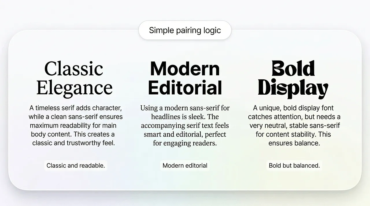
Classic, editorial, trustworthy
Serif fonts have small decorative strokes (serifs) at the ends of letters. These details create a sense of tradition and structure.
Serifs feel established, authoritative, and premium–ideal when you want a classic or vintage font style.
Serifs look beautiful in wordmark logo fonts, but thin serifs can disappear at small sizes. Test carefully.
Clean, modern, versatile
Sans serif fonts have no decorative strokes–clean, simple, and highly readable.
We like sans-serif fonts are for modern font styles and digital branding. Make sure you adjust spacing to avoid cramped wordmarks.
Elegant, personal, expressive
If you make your strokes smooth and balanced, the will look premium. Don’t over decorate or they will become hard to read and messy.
Avoid long names. Prioritise legibility over flourishes.
Attention-grabbing statement-makers
Display fonts are designed for headlines, not paragraphs. For the designer, you need to ensure that they are expressive and full of personality because you want them to grab attention.
Use display fonts sparingly. They shine in short, bold wordmarks.
Friendly, casual, human
A handwritten font is often more gentle and warm than more ‘typed’ looking fonts. They signal warmth, authenticity, and a popularly human touch.
Avoid overly textured, handwritten fonts for e-commerce headers, as they lose clarity.
Structured, technical, retro
The word monospace is simple to understand–it just means that every character occupies the same width. This creates a mechanical, grid-like look.
Great for short names, but can feel cold if not balanced with colour or layout.
Examples: modern, premium, playful, bold, elegant, friendly, technical. You know what your brand is like, so you should be able to choose these easily.
For example, if you are considering modern as an adjective, then you might consider sans serif, but if you want playful as a descriptor, you will be looking for a more handwritten look.
Check your font in:
A great brand font is both readable and recognisable.
Before choosing a specific typeface, it helps to decide which style era your brand belongs to. This gives your typography a clear emotional direction.
Modern fonts are clean, geometric, and minimal. They often use sans-serif or monospace structures and work well for tech and SaaS companies, brands that are digital-first, and startups. Choosing a modern font is all about communicating innovation, clarity, and confidence.
Vintage fonts draw inspiration from the 1920s to the 1980s. They often include high-contrast serifs, scripts that look retro, grotesque sans-serifs, and more textured display fonts. We like them for traditional food and drink brands, homemade and craft-type businesses, boutique retail and identities that are inspired by heritage. Vintage fonts communicate warmth, nostalgia, and authenticity.
Minimalist fonts strip away decoration and focus on clarity. They’re usually:
Minimalist fonts work for:
Minimalist typography communicates calm, sophistication and modernity.
Use one font for headlines and one for body text. This is clean, clear, and easy to read. It will be easy to recognise the style chosen because it won’t be overdone.
Choosing a font is one thing. Choosing a wordmark is another. Here is a simple checklist to evaluate whether your typography is working.
Can someone read your brand name instantly on mobile, favicon, and social media profile sizes? If not, it’s not the right font.
Does your wordmark look like every other brand in your industry? Or does it have a unique twist–spacing, shape, rhythm, or contrast?
Does the font reflect your brand’s tone? The audience for your brand will be expecting a certain look for the font and wordmark.
Does it hold up well at 16px and print sizes? We tend to find that thin serifs, overly textured scripts, and complex display fonts often fail this test.
Even the best font can look amateurish with poor spacing. This is where LogoDiffusion’s iterative prompts help you refine kerning until it feels balanced.
Modern, classic, friendly, premium, minimalist, or bold.
One of the biggest challenges in branding is visualising how different font styles will feel when applied to your brand name. LogoDiffusion solves this by letting you:
This means that instead of spending hours browsing font libraries, you can explore dozens of directions in minutes. All you need to do then is refine the best ones into a polished, scalable logo.
We suggest that you create 8-12 versions to explore spacing, weight, and personality.
This is where you will be making little changes to adjust kerning, weight, contrast, and the feel of the wordmark.
LogoDiffusion isn’t just a generator. It is a refinement tool. The real magic happens when you iterate. By generating 8-12 variations, then refining the spacing, weight, and tone. Once you have those refinements completed, it is a simple act to polish for details, focusing on alignment, rhythm, letter-shape consistency, and negative-space balance.
This is an important step that needs to be followed, because you want to ensure crisp scaling across all platforms.
Modern Sans Serif:
“Minimal wordmark logo for [Brand], modern sans serif, high readability, balanced kerning, clean spacing, monochrome, vector style.”
Premium serif:
“Premium serif wordmark for [Brand], high contrast but readable, elegant, minimal, refined letter spacing, vector logo.”
Friendly handwritten:
“Friendly handwritten-style wordmark for [Brand], simple strokes, readable at small sizes, modern, minimal texture, vector mark.”


.webp)

.webp)
.webp)