
.webp)

Choosing the right colour combinations for logos is one of the quickest ways to influence how people feel about your brand. The colours you pick affect memorability, mood, and readability–often before someone even processes the words in your logo. A strong logo colour palette can make your brand feel trustworthy, playful, premium, or eco-friendly at a glance.
This guide gives you everything you need: the main colour scheme types, 50 ready-to-use logo colour combinations with hex codes, and simple rules and prompts for choosing colours that actually work in the real world. This is the guide for finding out about two-colour logo combinations, three-colour logo combinations, and what the benefits of each are.
Quick tip before we dive in: choose one dominant colour and one or two accents. Simplicity scales better across websites, packaging, and social icons.
Before you look at the colour wheel for logos, define your brand in three words. For example, you might want to choose something like calm, modern, trustworthy or bold, youthful, energetic.
The adjectives you choose will guide whether you need a monochromatic logo colour, a triadic colour palette, or something more high-contrast, such as complementary colours.
Use the 60-30-10 rule from interior design:
This keeps your brand colour palette balanced and prevents visual clutter
A black-and-white logo colour scheme should always be the foundation. If your logo isn’t made Monochome is needed for applications liek embroidery, and for stamps, but especially for small icons where scalability is an important factor.
Low contrast is one of the biggest mistakes in logo design. Make sure text is readable against backgrounds, especially if you’re using light pastels or deep neutrals.
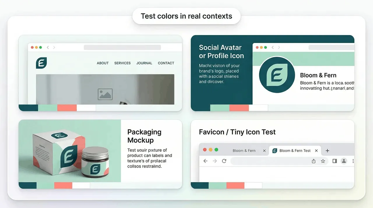
Place your colours in situations like:
Real-world testing reveals issues that you won’t spot on a blank canvas.
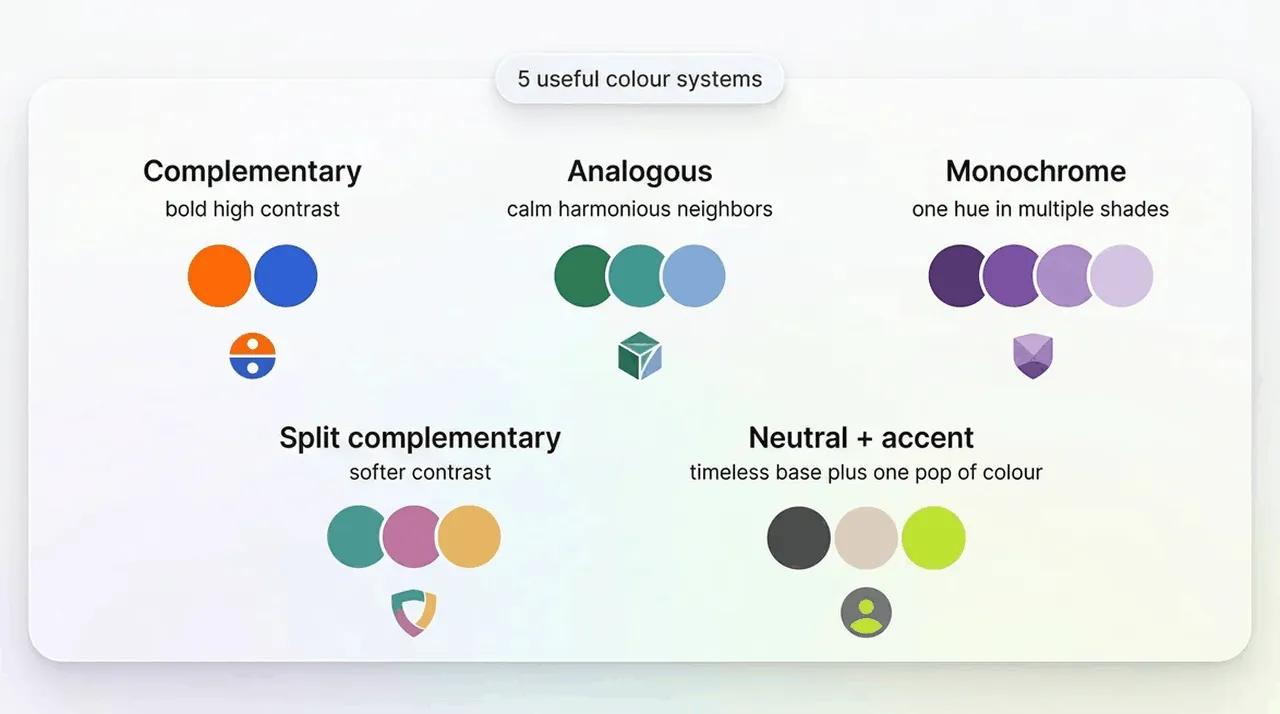
Colours that are situated opposite each other on the colour wheel are complementary colours. They are best for energetic, high-contrast, attention-grabbing logos.
These are great if you want a bold look, like blue-and-orange logo colours or red-and-green.
You’ll find analogous colours next to each other on the wheel. They are best for calm, harmonious brands seeking a more natural vibe.
You’ll want to choose analogous colours if you are a wellness brand or looking for eco brand logo colours.
This is one colour in multiple shades, best suited for a modern, minimal, and premium logo.
These usually work well for luxury, minimalist, or beauty brands.
This is a softer version of complementary, which is best for contrast without the harshness that can come from using directly opposite colours.
This combination uses a neutral base such as black, white, grey, or beige and adds one bold accent colour.
This combination works best for professional and timeless branding that is easily scalable.
Quick Tip: Remember that logo colour psychology is not an absolute science. The context, your industry, and the overall style of your brand can matter just as much as the colour itself.
Each palette includes a name, mood, industries, hex codes, and usage suggestions.
Grounded, calm, and earthy — ideal for eco brands, outdoor products, and wellness.
Hex: #0F3D2E, #7BAF8A, #F2F5EC
Use: Pine-dominant, moss accent, soft-cream background.
Soft, organic, and modern. Great for skincare, wellness, and sustainable goods.
Hex: #A8C1A1, #C97F5D, #F7F4EF
Use: Sage dominant, clay accent, neutral background.
Warm, rustic, and natural. Perfect for organic food brands and eco packaging.
Hex: #4A5A2C, #E2C99A, #FAF8F2
Use: Olive dominant, wheat accent.
Fresh and uplifting. Works well for eco‑tech, gardening, and outdoor services.
Hex: #3E7D4C, #8EC9E6, #FFFFFF
Use: Green dominant, blue accent.
Grounded and trustworthy. Ideal for agriculture, landscaping, and artisan goods.
Hex: #5A3E2B, #7FBF6A, #EFEDE8
Use: Brown dominant, green accent.
Clean, modern, and refreshing. Great for wellness, spas, and sustainable fashion.
Hex: #BCE7D0, #333333, #FFFFFF
Use: Mint dominant, charcoal accent.
Natural with a premium twist. Works for eco‑luxury and botanical beauty brands.
Hex: #6E8B55, #D9C7A1, #F9F7F2
Use: Moss dominant, beige accent.
Calm and coastal. Ideal for eco‑travel, skincare, and lifestyle brands.
Hex: #2F7F72, #E8D9C5, #FFFFFF
Use: Teal dominant, sand accent.
Cool, clean, and modern. Great for eco‑tech and minimalist wellness brands.
Hex: #1F4F4A, #DDE3E1, #FFFFFF
Use: Spruce dominant.
Fresh with a gentle warmth. Perfect for natural food and beauty brands.
Hex: #6FA66F, #F4C7B7, #FAF9F7
Use: Green dominant, peach accent.
Confident and modern. Great for tech, agencies, and ecommerce.
Hex: #0B1F3B, #FF7A00, #F5F7FA
Use: Navy dominant, orange accent.
High‑contrast and crisp. Ideal for SaaS, fintech, and IT services.
Hex: #0077FF, #4A5568, #F8FAFC
Use: Blue dominant.
Professional with a fresh edge. Works for tech startups and consultants.
Hex: #3C4650, #4FD1C5, #FFFFFF
Use: Grey dominant.
Energetic and modern. Great for app logos and digital products.
Hex: #0A1A33, #B4FF3B, #F2F4F7
Use: Blue dominant.
Clean and corporate. Ideal for B2B, finance, and engineering.
Hex: #1A4DB3, #C9D1D9, #FFFFFF
Use: Blue dominant.
Modern and bold. Perfect for creative tech and digital agencies.
Hex: #0F8A8A, #FF6F61, #F7FAFA
Use: Teal dominant.
Reliable and calm. Great for IT support and cloud services.
Hex: #2E2E2E, #8ECDF2, #FFFFFF
Use: Graphite dominant.
Fresh but professional. Works for modern consultancies and SaaS.
Hex: #0C2340, #A8F0D6, #F8F9FA
Use: Navy dominant.
Strong and trustworthy. Ideal for enterprise tech.
Hex: #0047AB, #2F2F2F, #F5F5F5
Use: Cobalt dominant.
Minimal and high‑contrast. Great for futuristic tech brands.
Hex: #D6F1FF, #000000, #FFFFFF
Use: Black dominant.
Classic luxury. Perfect for jewellery, fashion, and premium services.
Hex: #000000, #D4AF37, #FFFFFF
Use: Black dominant.
Elegant and creative. Great for beauty and boutique brands.
Hex: #4B1F3F, #EEDCCB, #FFFFFF
Use: Plum dominant.
Modern luxury with warmth. Ideal for premium lifestyle brands.
Hex: #0D1B2A, #E8AFAF, #FAFAFA
Use: Navy dominant.
Rich and sophisticated. Works for high‑end wellness and fashion.
Hex: #0F5E4D, #D9B650, #F7F5F0
Use: Emerald dominant.
Minimal and timeless. Great for architecture and interior brands.
Hex: #2B2B2B, #F2EFEA, #FFFFFF
Use: Charcoal dominant.
Warm and premium. Ideal for wine, hospitality, and boutique services.
Hex: #6A1F2A, #E6C98E, #FAF7F2
Use: Burgundy dominant.
Moody and luxurious. Perfect for artisanal and heritage brands.
Hex: #003D3B, #C47E5A, #F5F3EF
Use: Green dominant.
Rich and classic. Great for luxury cafés and lifestyle brands.
Hex: #3B2F2F, #F5EDE2, #FFFFFF
Use: Espresso dominant.
Regal and authoritative. Ideal for law firms and premium services.
Hex: #0A1A3C, #D4B46A, #F8F8F8
Use: Navy dominant.
Soft luxury. Works for beauty, skincare, and minimalist brands.
Hex: #4A4F57, #F2F1EE, #FFFFFF
Use: Slate dominant.
Bright and fun. Great for kids’ brands and creative studios.
Hex: #FF6F61, #4FD1C5, #FFFFFF
Use: Coral dominant.
Soft and modern. Ideal for lifestyle and beauty brands.
Hex: #C9B6E4, #BCE7D0, #FFFFFF
Use: Lavender dominant.
Bold and edgy. Perfect for streetwear and nightlife brands.
Hex: #FF2DAA, #000000, #FFFFFF
Use: Black dominant.
Soft and friendly. Great for modern cafés and social brands.
Hex: #F7C8B4, #A8D8FF, #FFFFFF
Use: Peach dominant.
Energetic and modern. Works for fitness and youth brands.
Hex: #C7FF3D, #333333, #FFFFFF
Use: Charcoal dominant.
Bright but grounded. Ideal for creative agencies.
Hex: #FFD93D, #0B1F3B, #FFFFFF
Use: Yellow accent, navy dominant.
Soft, modern, and friendly. Great for lifestyle and beauty.
Hex: #C7F9E9, #DCC7FF, #FFD6C2
Use: Mint dominant.
Vibrant and modern. Perfect for social apps and creative brands.
Hex: #2AB7CA, #FF6F91, #FFFFFF
Use: Teal dominant.
Futuristic and bold. Great for gaming and digital brands.
Hex: #39FF14, #0A0A0A, #FFFFFF
Use: Midnight dominant.
Friendly and modern. Ideal for community and lifestyle brands.
Hex: #A7D3F5, #F7A8B8, #FFFFFF
Use: Blue dominant.
Warm and appetising. Perfect for restaurants and food products.
Hex: #D64545, #F7EDE2, #FFFFFF
Use: Red dominant.
Bold and modern. Great for cafés and street‑food brands.
Hex: #E76F51, #2A2A2A, #FFFFFF
Use: Orange dominant.
Earthy and warm. Ideal for Mediterranean cuisine.
Hex: #6B7A3A, #C96F4A, #F8F4EF
Use: Olive dominant.
High‑contrast and bold. Perfect for fast food and sports bars.
Hex: #C1121F, #000000, #FFFFFF
Use: Black dominant.
Warm and comforting. Great for bakeries and cafés.
Hex: #F2C94C, #6B4F2A, #FFFFFF
Use: Yellow accent.
Friendly and modern. Works for brunch cafés and dessert brands.
Hex: #FF5A5F, #F5EDE2, #FFFFFF
Use: Coral dominant.
Autumnal and rich. Ideal for organic food brands.
Hex: #F28C28, #2F4F2F, #F7F5F0
Use: Pumpkin dominant.
Classic and elegant. Great for wine bars and fine dining.
Hex: #7A1E3A, #F7EFEA, #FFFFFF
Use: Red dominant.
Warm and inviting. Perfect for bakeries and cafés.
Hex: #F7BFA0, #5A3E2B, #FFFFFF
Use: Apricot dominant.
Bold and modern. Works for spicy food brands and street food.
Hex: #E63946, #4A4F57, #FFFFFF
Use: Red dominant.
This ensures the structure that you want to use is in place, before adding colour.
Keep the layout the same. Only the colours should change.
Make sure you refine your ideas. Ask for a warmer, cooler, more premium, or more playful version. Just make sure that you know you are legally able to use the design elements through licensing.
Try the logos on your website, packaging, and social icons, to see what works where, and if you need to create further iterations.


.webp)

.webp)
.webp)