Wordmark Logo Design: What It Is, When to Use It, and How to Get It Right

A wordmark is a logo made of the brand name alone. There is no symbol beside it: the letters are drawn so the name itself is the logo. Below are five real ones made in Logo Diffusion, each with the exact prompt behind it, so you can see which words changed the letters. The first was typed into Text to Logo with the Logo Type style selected:
online tutoring platform called "brain spark", lightbulb with neural lines, minimalist smart logo

What is a wordmark logo?
A wordmark, also called a logotype, is the full brand name set in lettering made for it. Everything the logo says comes from the letters: their shape, weight, spacing and color. BrainSpark still counts as one, because its only picture is a letter.
Three other logo types get mixed up with it. A lettermark uses initials in place of the full name. A combination logo puts the name next to a symbol that can also be used on its own, and our guide to combination logos covers that layout. An emblem sets the name inside a badge or crest, so the two never come apart.
In Logo Diffusion, two styles make logos from letters alone: Logo Type for names and Monogram for initials. This lettermark came from Monogram:
S lettermark featuring a silhouette of a horse's head within the letter's negative space.

When a wordmark is the right choice
Pick a wordmark when the name is the thing people need to remember and it is short enough to read at a glance. One or two words is the comfortable range. An unusual name helps: First Churn, further down, gives the letters something to work with. A common word shared by many businesses is hard to make your own with lettering alone.
Skip it, or pair it with a lettermark, when:
- the name runs past two or three words, because it shrinks to thin type in small spaces
- you need a square icon for an app, a social profile or a browser tab, where a whole word rarely fits
- people mostly see you from a distance or in motion, on signs or vehicles, where a simple symbol is read faster
The usual setup is the wordmark wherever there is room for the full name and a lettermark for the small square spaces.
How to get a wordmark in Logo Diffusion
Open Text to Logo in the AI logo generator and choose the Logo Type style, or leave it on Auto and Text to Logo picks a style from your words. Write the name in quotation marks: text inside quotation marks is the name you want in the logo. Everything else in the prompt decides how the letters look.
When you click Generate, the built-in prompt enhancer rewrites your prompt first. Turn it off when you want a specific letter change kept in your own words.
The prompts below each changed the letters in a different way. The wording does most of the work: one of them came from the Pictorial style, with a prompt that asked for lettering only, and each caption names the style used.
Name the letter style
Serif, sans-serif, script, blackletter or graffiti: the letter style is the biggest single choice in a wordmark, so put it in the prompt along with a word or two about weight.
Elegant cursive wordmark logo for "First Churn". Typography: refined handwritten or calligraphic script, smooth flowing strokes, minimal flourishes, high readability Style: quiet luxury, sophisticated, modern craft Feel: calm, premium, personal, trustworthy Avoid: overly decorative swashes, vintage rustic style, playful script Color: black on off-white background Design: clean, balanced spacing, subtle stroke contrast, flat vector, no gradients
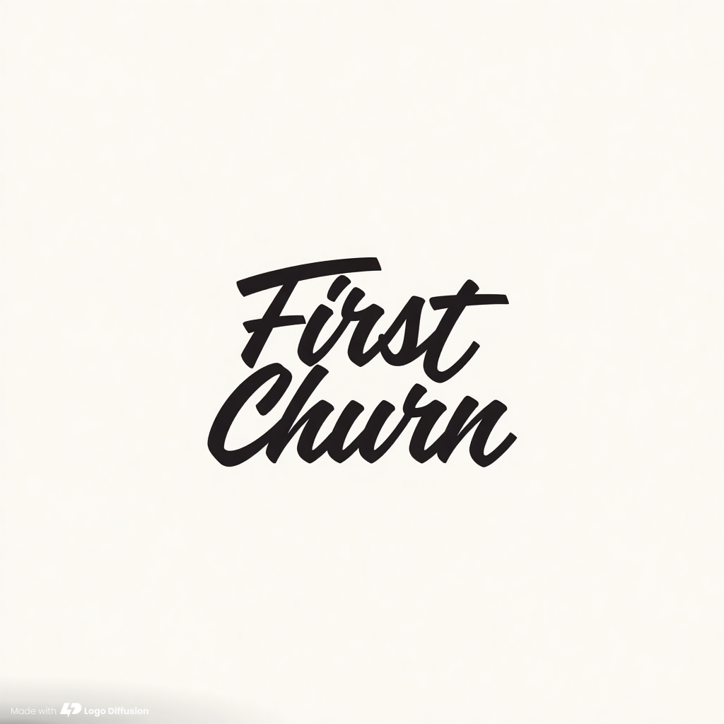
For each letter style and a prompt line to start from, see our guide to types of fonts.
Describe the edges and the mood
Words about edges change every letter at once. A motif from the name's world can ride on the word as well.
Stylized signature mark showing the text "Artemis" with sharp, edgy urban calligraphy integrated with flying bats

Give one letter a job
Change one letter and leave the rest plain. BrainSpark at the top does this: the prompt named one object, a lightbulb, and it became the S while the other nine letters stayed plain bold sans-serif. One changed letter reads as a detail, and the name still reads at a glance. If you have a letter in mind, name it: “the S as a lightbulb” leaves less to chance than “a lightbulb”.
Let letters touch, and name the colors
Two letters that share a stroke read as one drawn shape, which is what separates a wordmark from a name typed in a font. Colors work like letter styles: say them in plain words.
"CP" black and white

One or two colors keep a wordmark easy to print and stitch. Our logo color combinations guide has pairs that hold up in two colors.
Make your logo with Logo Diffusion's AI logo generator. Describe it, sketch it or upload an image, then turn it into a layered SVG with Vectorize. Try it for free.
Check it before you keep it
Run these checks on every option you like:
- Shrink it to the size of a browser tab icon. If the name blurs, try a heavier weight or a shorter form of the name.
- Look at it in one color, dark on light and light on dark. A wordmark that needs its color to read will struggle on a receipt or an embroidered shirt.
- Show it to someone who does not know the name and ask them to read it out. If they read a different word, the letter they got wrong is the one to fix.
- If none of the options is right, change one phrase at a time and generate again, so you can see what each word does.
To fix a single letter in a logo you like, describe the change in the Magic Editor, which edits a logo from a text instruction. For more on reading results and tightening a prompt, see 5 steps for refining AI logo prompts.
Frequently asked questions
Does a word mark on a trademark form mean the same as a wordmark logo?
Not quite. On a trademark application, a word mark usually means the name registered as plain text, with no particular lettering. A wordmark logo is the name drawn in specific letters, which is a design.
Not quite. On a trademark application, a word mark usually means the name registered as plain text, with no particular lettering. A wordmark logo is the name drawn in specific letters, which is a design.
Can I turn a logo I already have into a wordmark?
Yes. Open it in the Magic Editor and run Logo System, one of its Elements. It turns one logo into wordmark, lettermark, emblem and symbol versions. Elements cost the same as other Magic Editor edits: 5 credits on the default Base setting.
Yes. Open it in the Magic Editor and run Logo System, one of its Elements. It turns one logo into wordmark, lettermark, emblem and symbol versions. Elements cost the same as other Magic Editor edits: 5 credits on the default Base setting.
How much does it cost to make a wordmark in Logo Diffusion?
Text to Logo costs 2 credits per image. A paid generation returns 4 options for 8 credits, and a free one returns 2 options for 4 credits. The free plan has 24 credits a month and needs no credit card.
Text to Logo costs 2 credits per image. A paid generation returns 4 options for 8 credits, and a free one returns 2 options for 4 credits. The free plan has 24 credits a month and needs no credit card.
Can I use a wordmark made in Logo Diffusion for my business?
Every logo made on a paid plan is licensed for commercial use, and the license stays after the subscription ends. Free-plan generations carry no commercial license.
Every logo made on a paid plan is licensed for commercial use, and the license stays after the subscription ends. Free-plan generations carry no commercial license.


Try what you just read.
The honest test is a real project, not a demo. 24 credits, no card.